Empowering ACF Fiorentina's B2B
with a custom digital platform
that amplifies engagement.

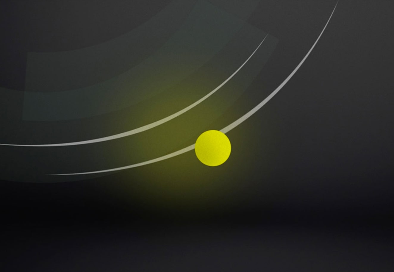
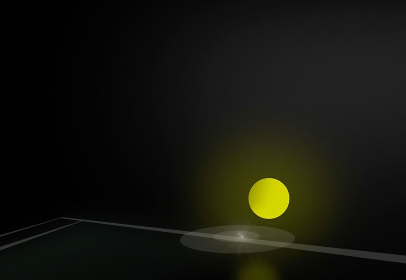
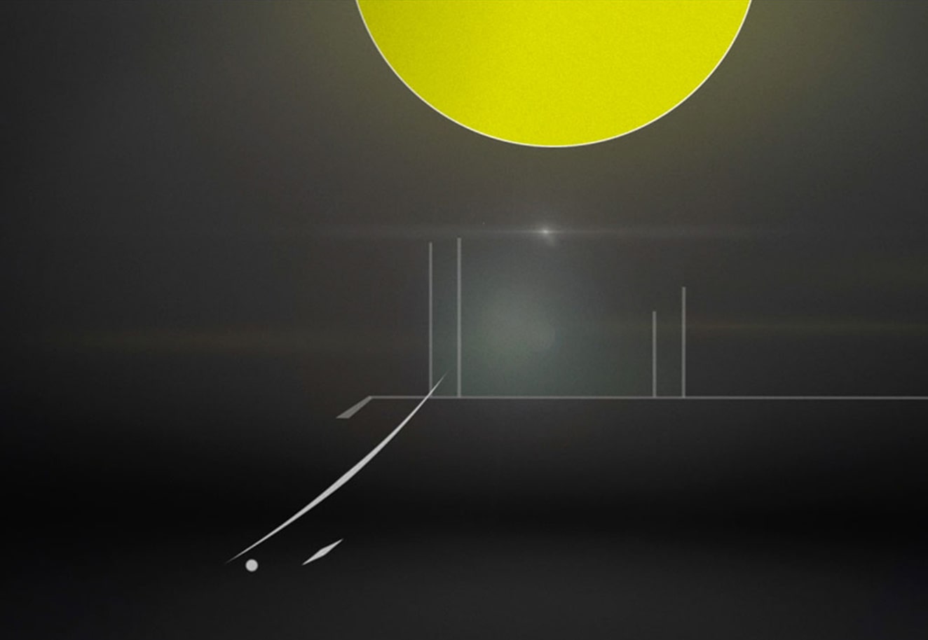
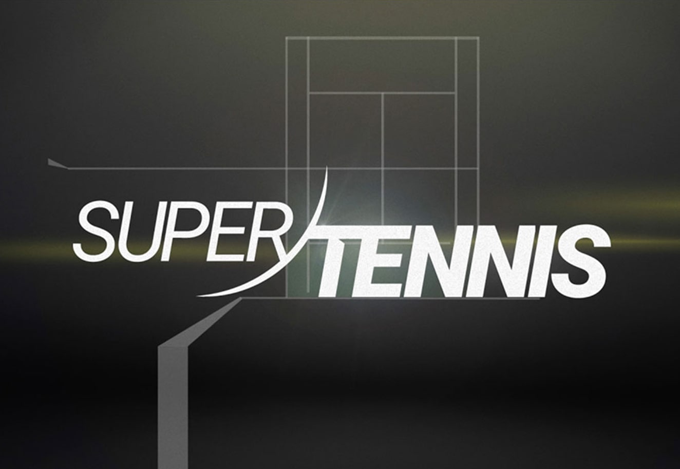
SUPERTENNIS
Create a tv channel branding for the tennis that counts.
BRIEF
SuperTennis is the Digital Terrestrial television channel dedicated to Tennis. A constantly open window on one of the most followed sports wordwide. However, its image requires a complete restyling.
SOLUTION
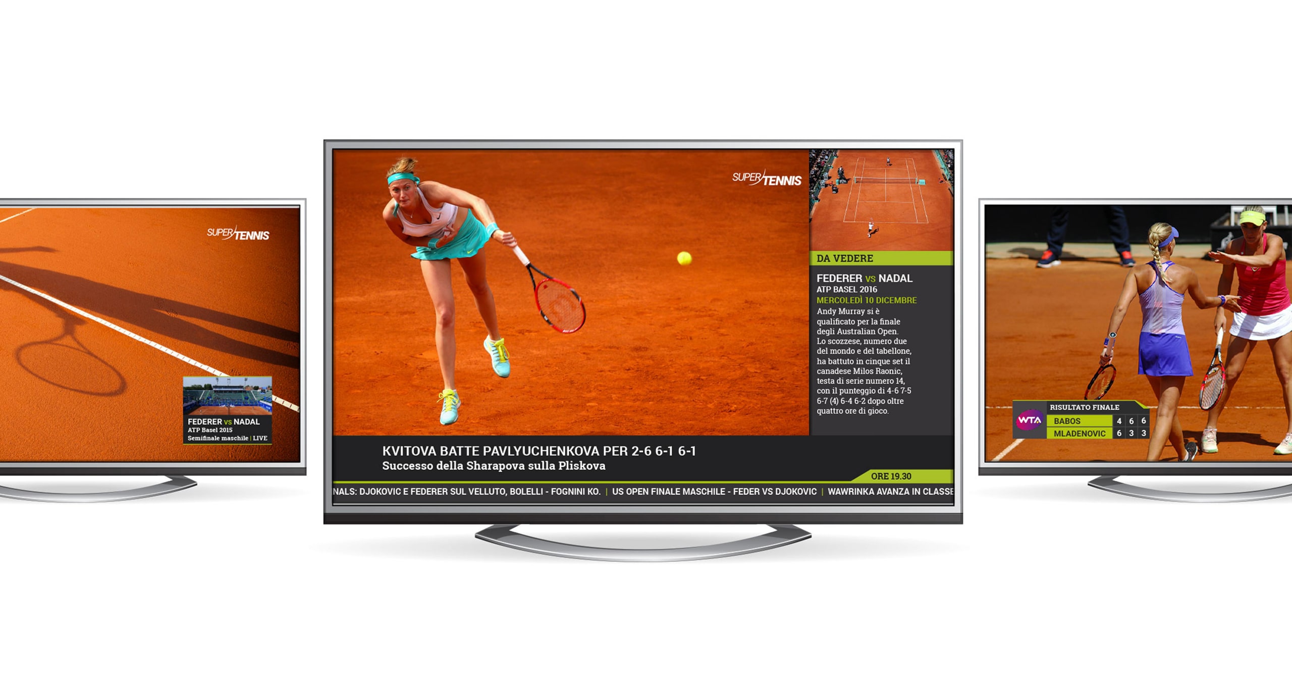
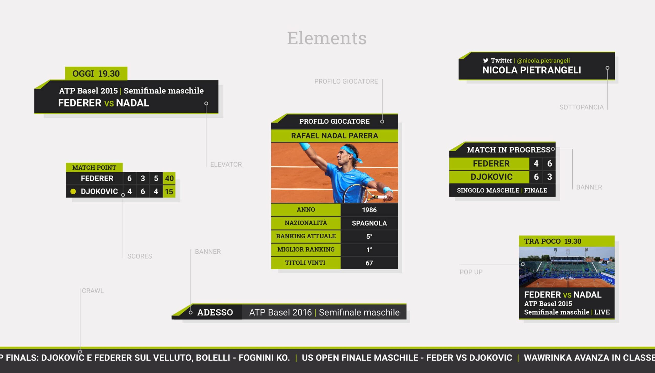
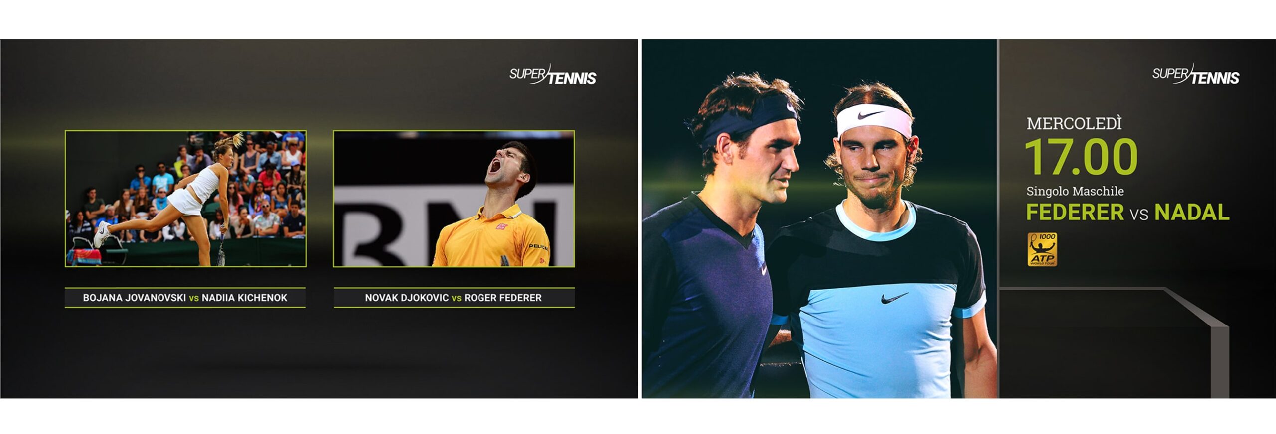
We began with a new logo with and from logo animation. The tv channel branding then involved taking it further; renovate the broadcast design, including bugs, pop-ups and banners, so as to give life to a tv portal dedicated to tennis addicts.
THE FONT, A SANS-SERIF WITH A CONTEMPORARY FLAVOR LIKE ROBOTO, SUGGESTS MOVEMENT AND MODERNITY.
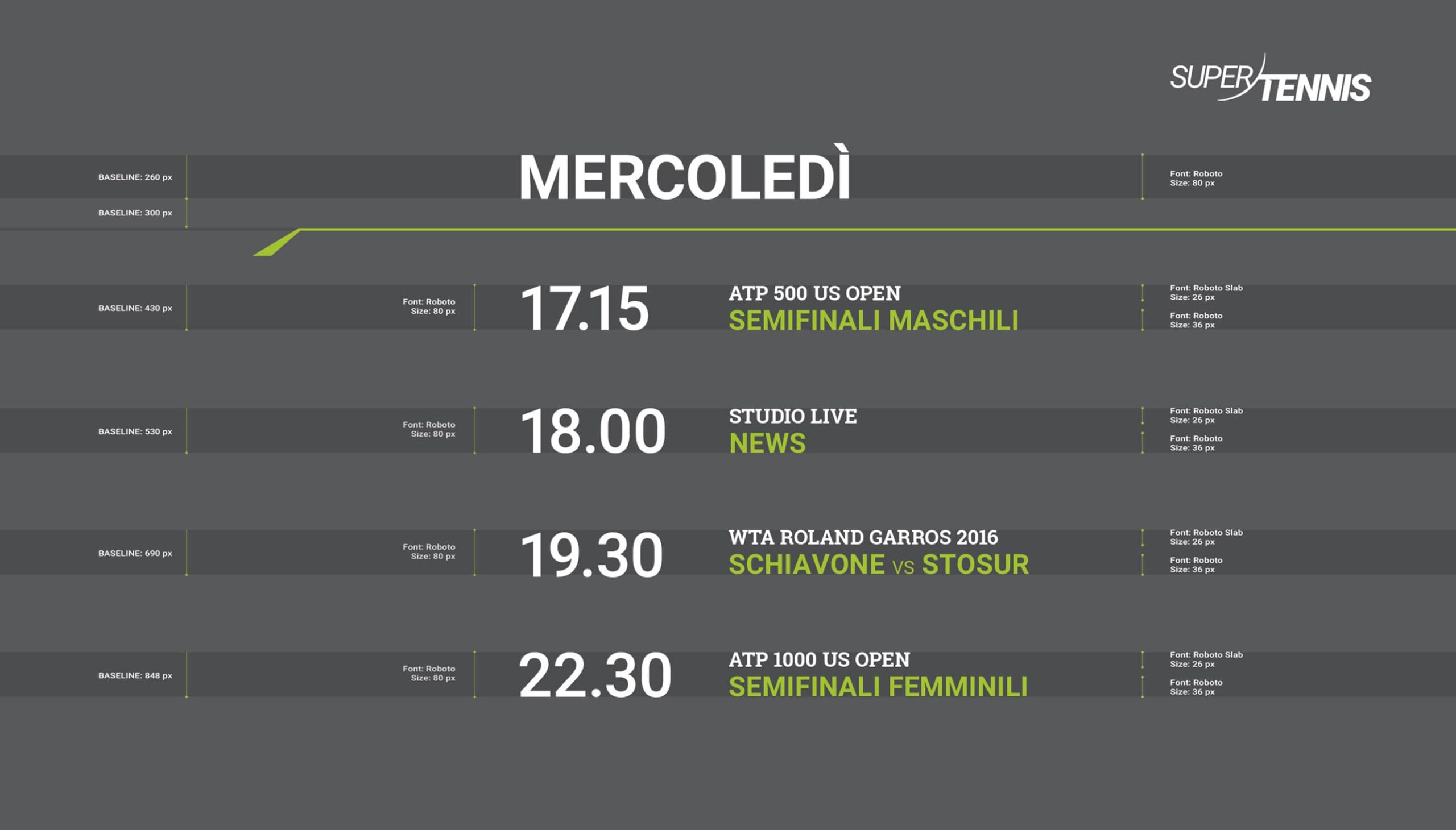
A CLEAR AND EXHAUSTIVE GRID
The graphics highlight information and coming events in a natural way. Underlying the new grid is a state of the art in-depth study on broadcasting design.
A UNIFORM AND CONCEPTUALLY COHERENT RESTYLING.
From the bugs to the pop-ups, from banners to the scoreboards, SuperTennis leaves staticity behind and becomes an ever-evolving network for the ever more web-oriented audience.
TEAM
Concept & Art Direction
Stanislao Migliorino
Account Manager
Giulia Martinis
Broadcasting Design
Andrea Simone, Flavia Ballarin
Parnter
DOING
WHAT WE DID
Art Direction
Video in motion graphic 3D & 2D
Graphic Design
Branding
RELATED PROJECTS →