DEAMBROSIS GROUP
DEAMBROSIS GROUP
Rebranding and repositioning of an e-bike market first mover.

BRIEF
Deambrosis Group is the leading holding company in the e-bike and tire sector for the b2b and b2c market, based in Monferrato. The company wants to increase its brand awareness and launch the new Monferrato Bike portal but seems to be stuck on itself. To date, in fact, the brand presents itself as the sum of four sub-brands that do not communicate with each other or with the parent company. Objective: to bring to light the identity, values, positioning and tone of voice of each of the brands that make up the Deambrosis ecosystem and inaugurate a new season for the Group.
SOLUTION
To make the Deambrosis brand more “human” and inclusive, we started with a new ratio that brought order to its brand architecture. Then, we worked on the identity, starting with fresher and more current namings and a coordinated logo design but, at the same time, able to enhance the specificities of each sub-brand. Finally, for the Group’s leading brand, Monferrato Bike, we worked hand in hand with the Fifth Beat team to carry out a major restyling of the e-commerce, leveraging personality, creativity and content.

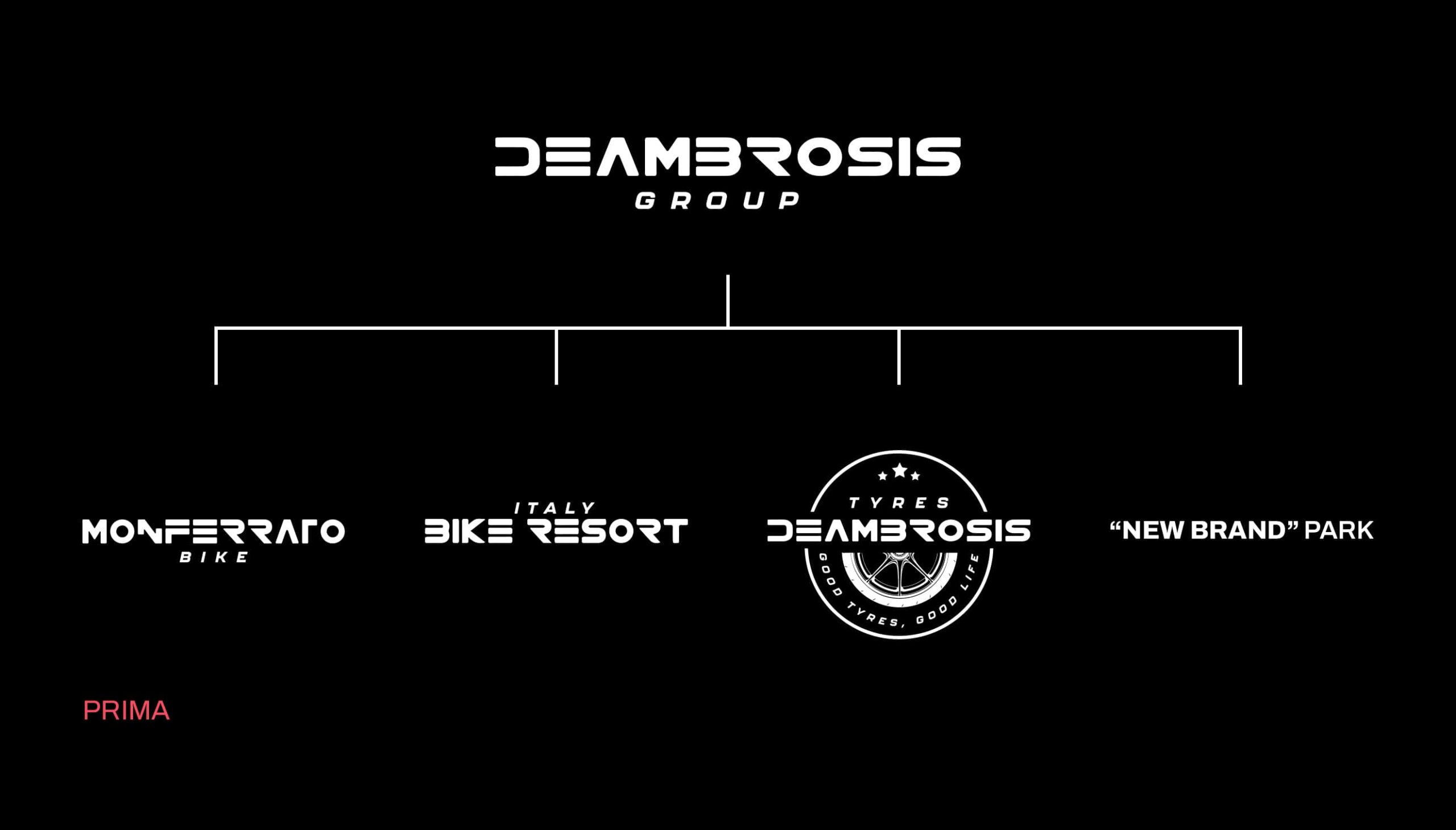
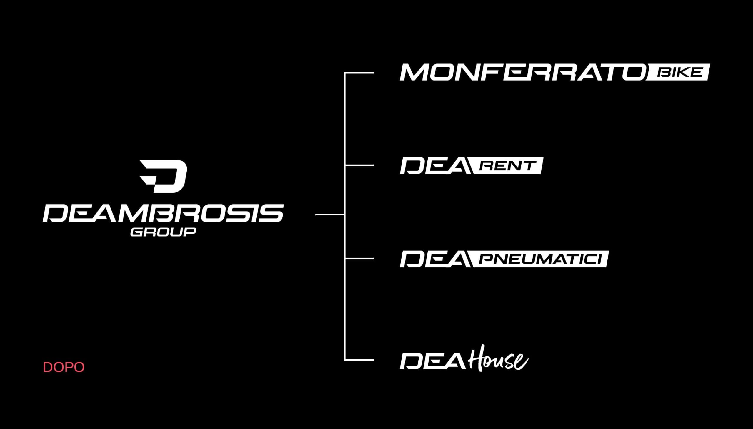
A BRAND ARCHITECTURE IN LINE WITH STRATEGIC OBJECTIVES.
We have built a dynamic and integrated ecosystem where all elements are interconnected and speak the same language. The new architecture is based on three key points: a cool and current short name; specific keywords for each operational area that clearly differentiate the offer; the endorsement that explicitly expresses the belonging to the Group. The chosen names exalt the brand’s identity, transforming Deambrosis into a contemporary player with great appeal.
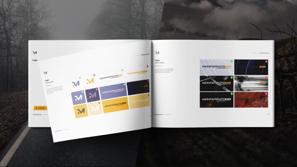
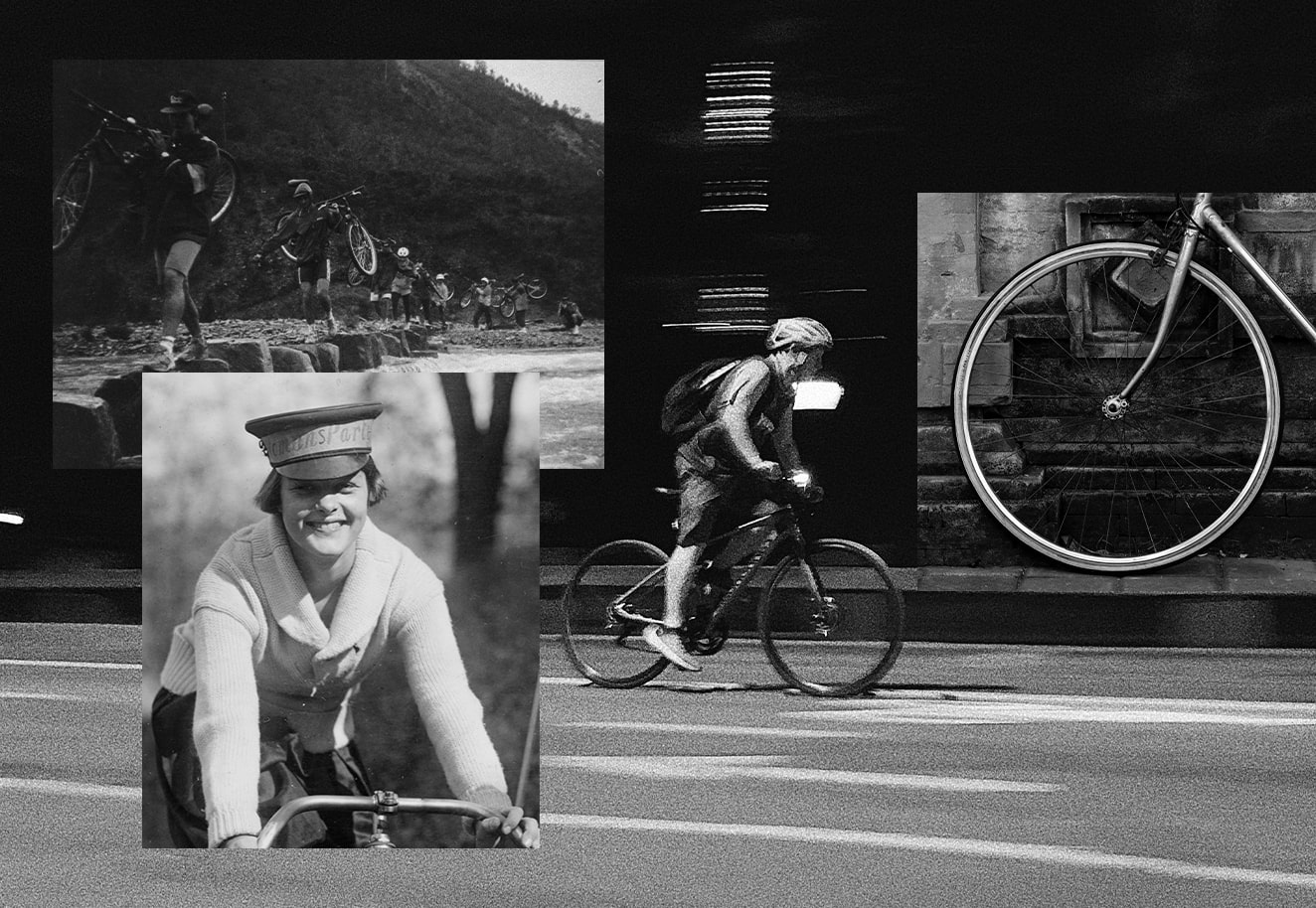
WE SUMMARIZE THE CONCEPT OF OUTDOOR WITH A TYPOGRAPHY THAT IS PURE ENERGY.
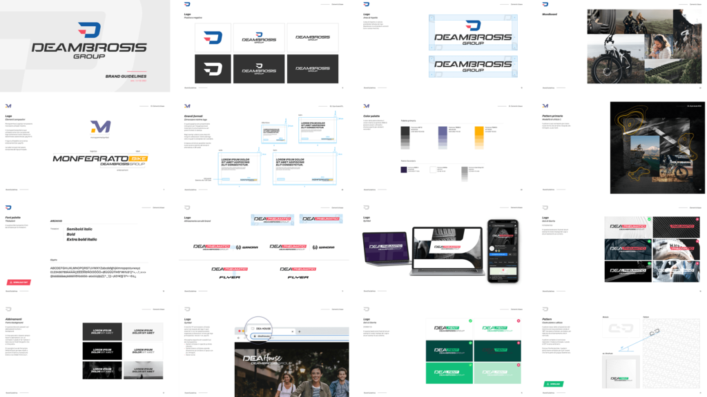
We have created a logo system that optimizes communication to attract users to online and offline touchpoints. The acronym “DEA”, followed by colored labels, turns to a sporty and easy-to-remember language that translates into a synthetic and versatile graphic sign. The corporate brand is characterized by an all-encompassing pictogram of all the Group’s assets, creating a perfect mix between the values of the past and those of the future. Finally, five style guides complete the great work of systematization of this e-bike giant.


For each of the Deambrosis brands we have studied a new message, identified a new positioning, the right TOV and a mantra that hits the mark, establishing guidelines that differentiate products and services, and creating 4 strong and distinctive personalities.
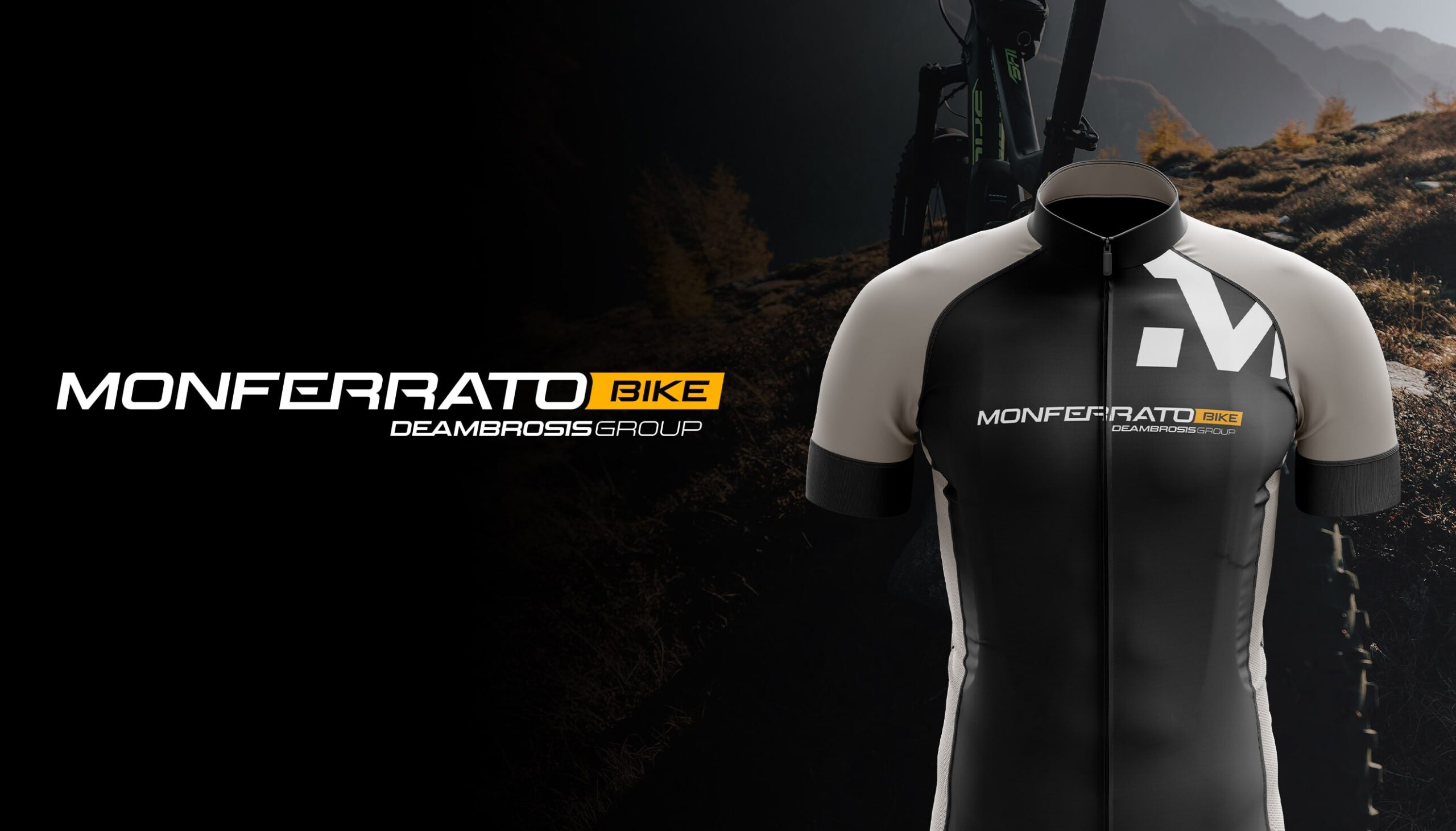
FOCUS ON: MONFERRATO BIKE, THE BRAND THAT SPEAKS THE LANGUAGE OF RIDERS.
The design conveys the idea of an outdoor experience to match the mission: e-commerce and cycle tourism. The monogram recalls the idea of itinerary and adventure, giving us all the suggestion of nature and its vibes. The use of collage or picture in picture on viewers and banners allows us to obtain layouts with a fresh and contemporary look, capable of condensing different concepts into a single visual. A catchy, friendly and SEO-oriented copy makes Monferrato Bike’s storytelling an emotional journey through time, from the expertise of the past to the know-how of the future.

TEAM
Creative Director
Michele Savino
Account Manager
Serena Russo
Copywriter & Brand strategist
Sofia Francesca Miccichè
Art Director
Flavio Milazzo
Brand Designers
Stanislao Migliorino, Andrea Simone
Graphic Designer
Annalisa Femiano
Video & Motion Designer
Beatrice Carosi
WHAT WE DID
Copywriting
Art direction
Brand design
Brand strategy
Content strategy
Video design
RELATED PROJECTS →