ITA/ICE
ITA/ICE
Redesign the Italian Trade Agency Brandbook.
BRIEF
The Italian Trade Agency contacted us with a very clear objective; restyle the corporate identity and summarize it into a contemporary brandbook. Objective: convey solidity and align the Agency’s image worldwide. We snatched up the opportunity to work with this giant of worldwide Made in Italy promotional activity to take up the challenge of an institutional context while at the same time thinking outside the box.
SOLUTION
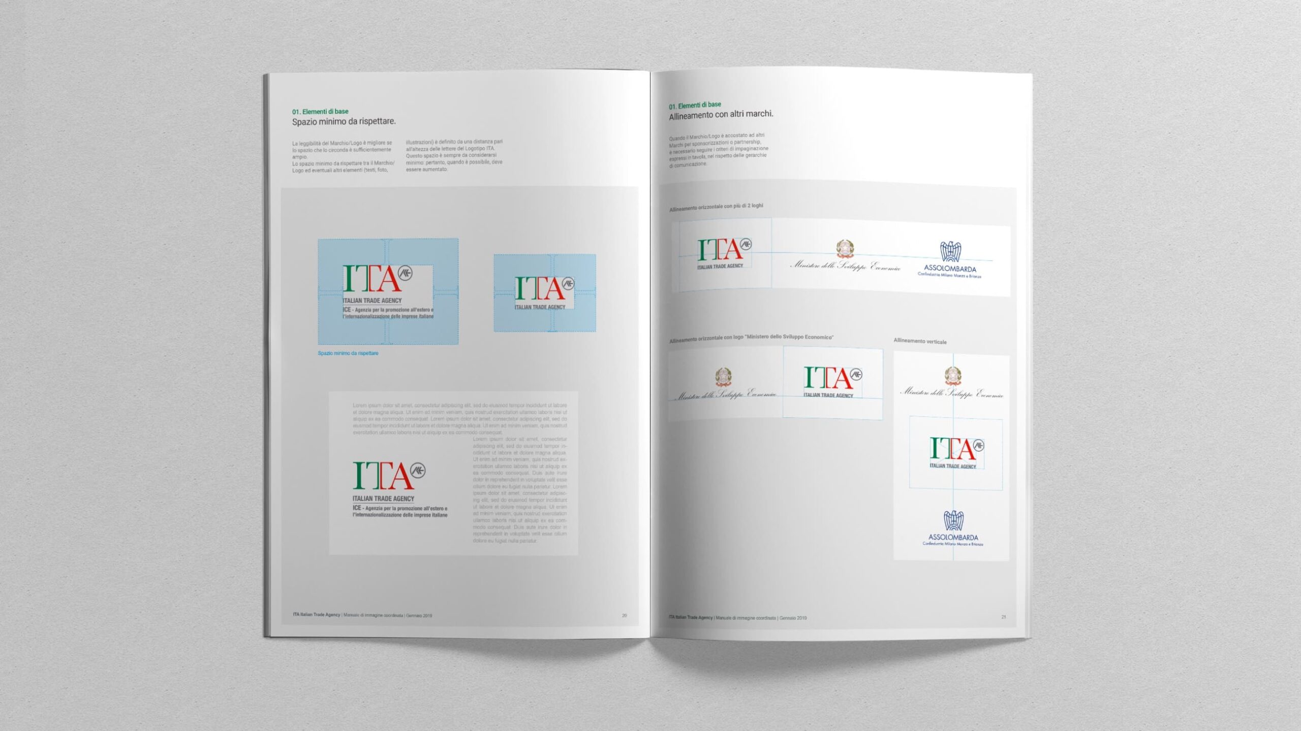
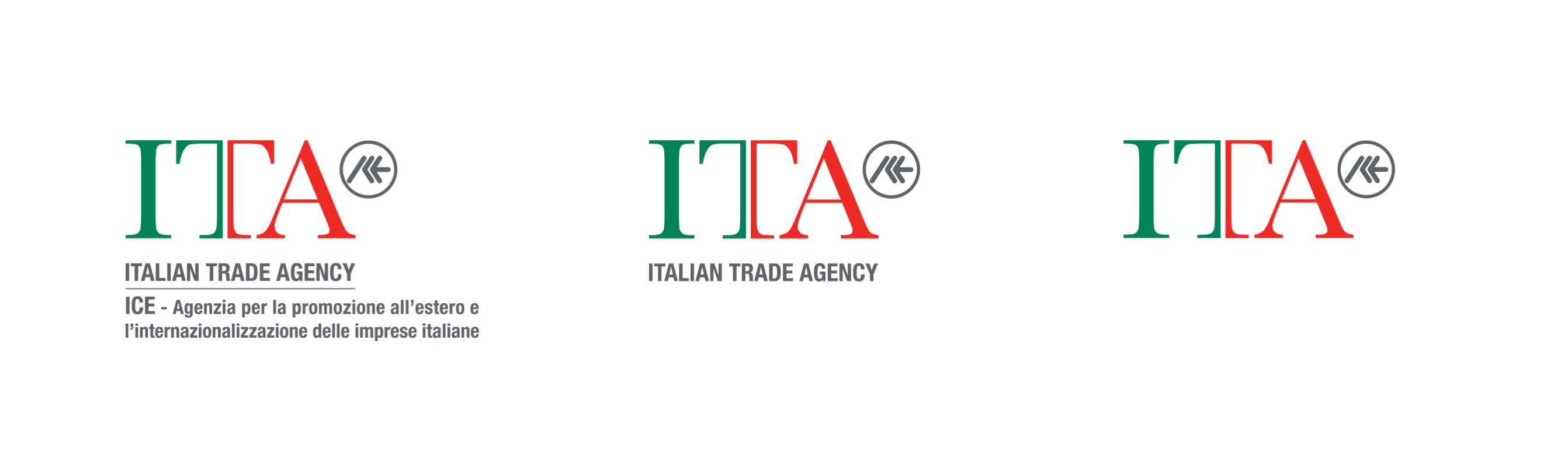
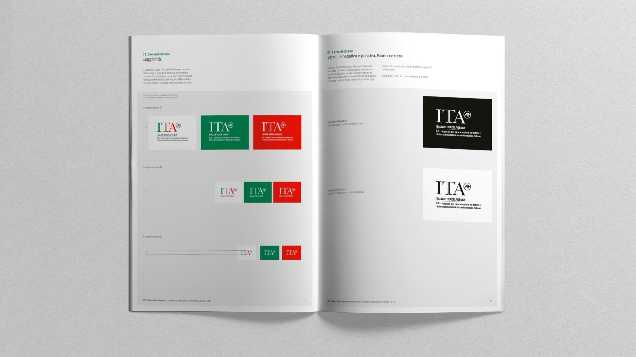
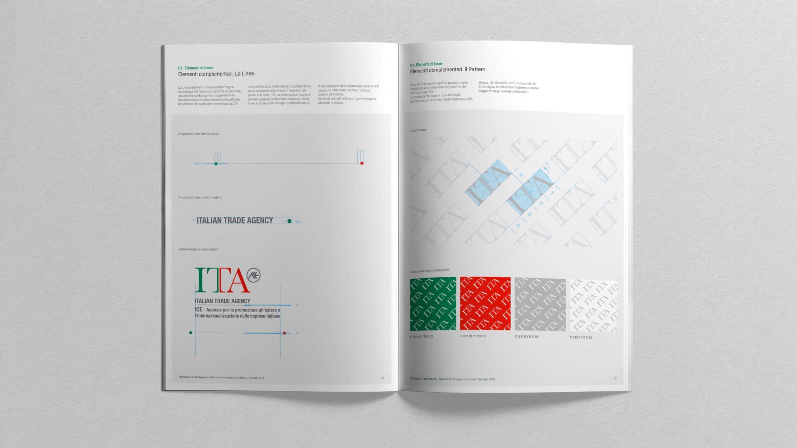
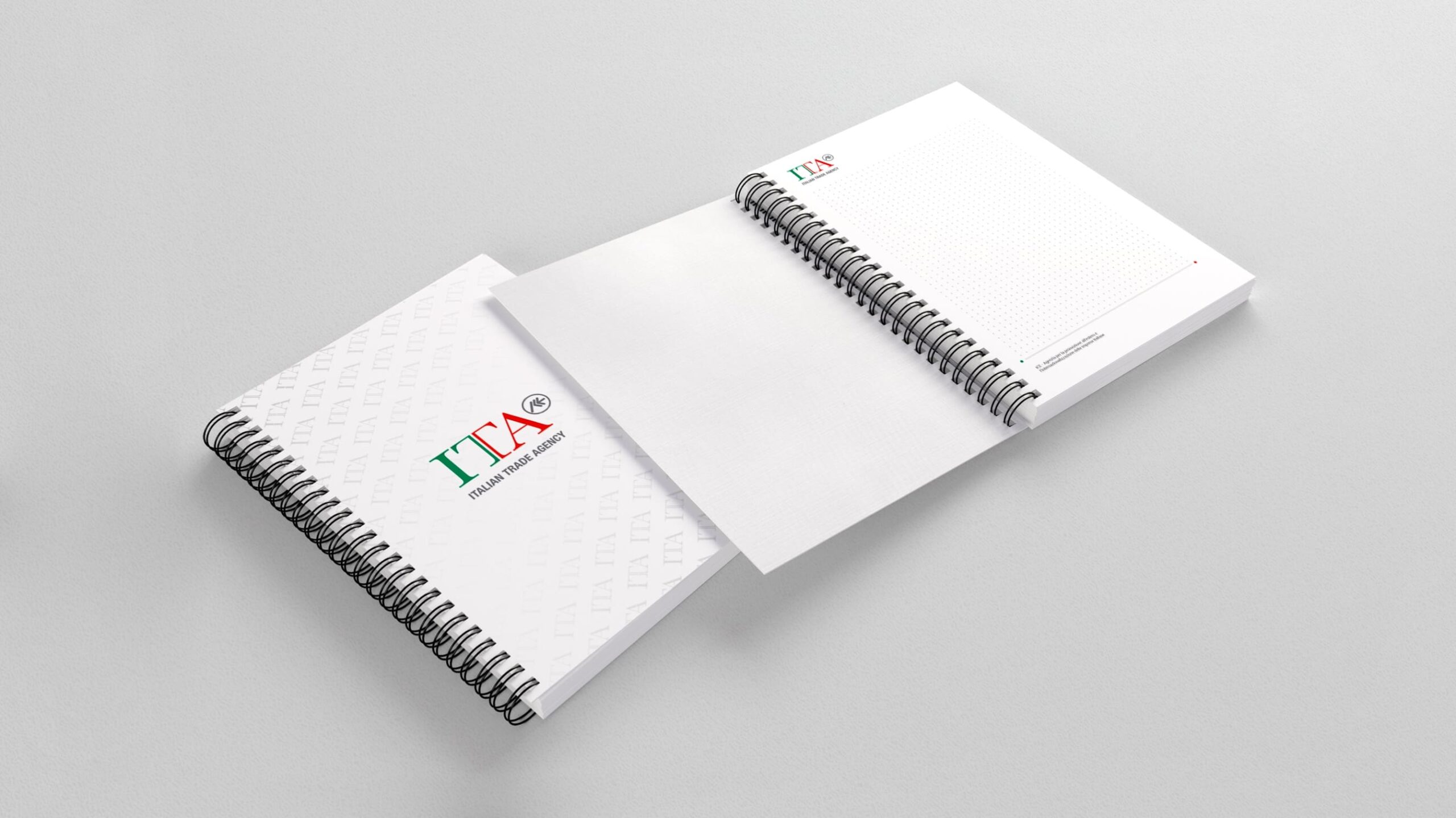
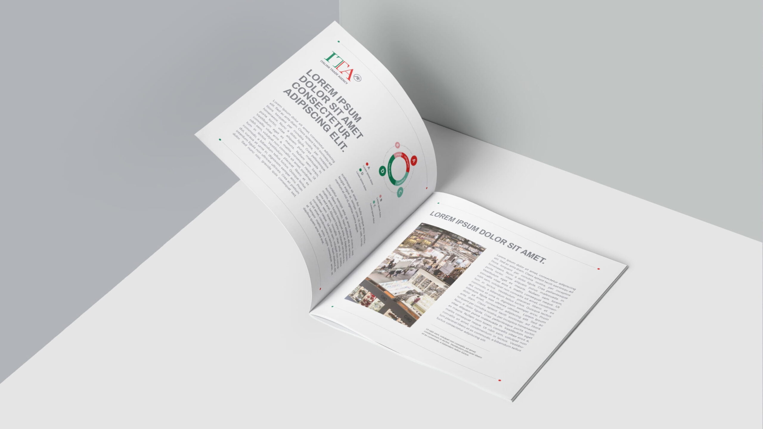
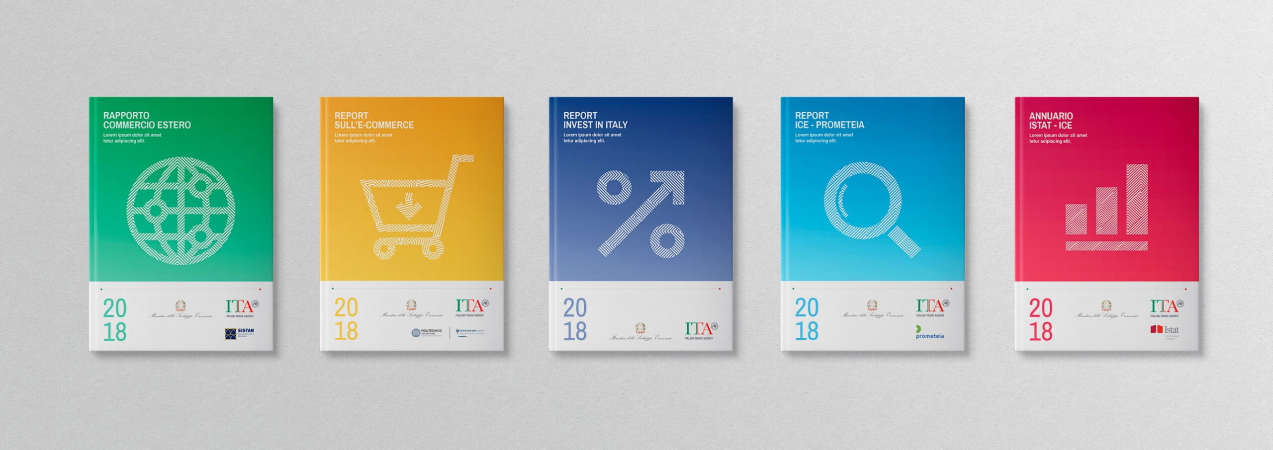
We literally expanded on the different aspects of the previous brandbook in a search for those aspects which were farthest from the brand’s present positioning, to then establish a new hierarchy of contents which focused on the annual reports, diversifying them through thematic pantones. We isolated the key elements of the brand’s visual identity to then reconstruct them in a streamlined and geometric style: the graphic icon that is recurrent in the new coordinated design is the Italian flag, synthesized in the graphic image of a line.
CORPORATE ELEMENTS
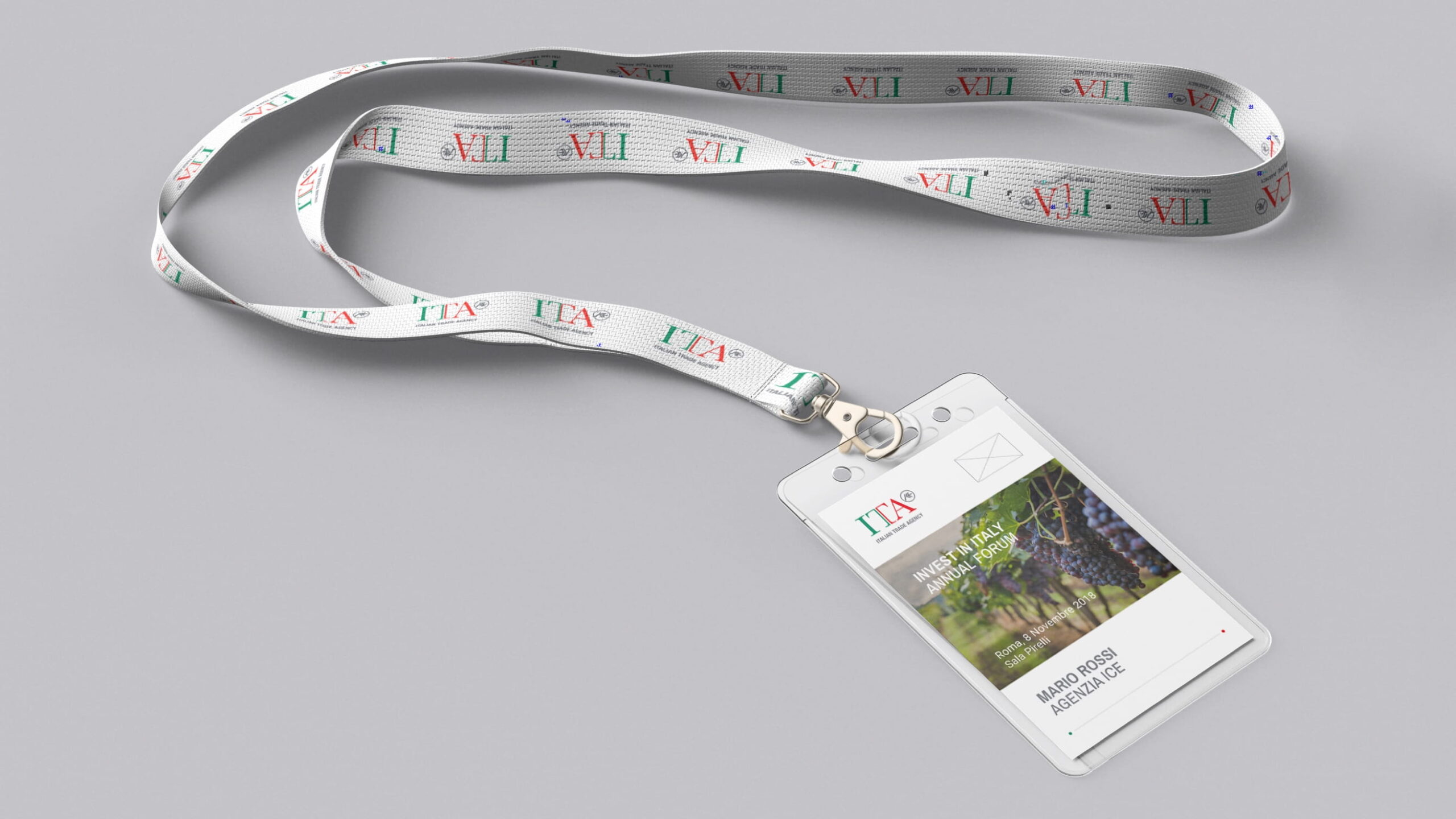
EVENT ELEMENTS
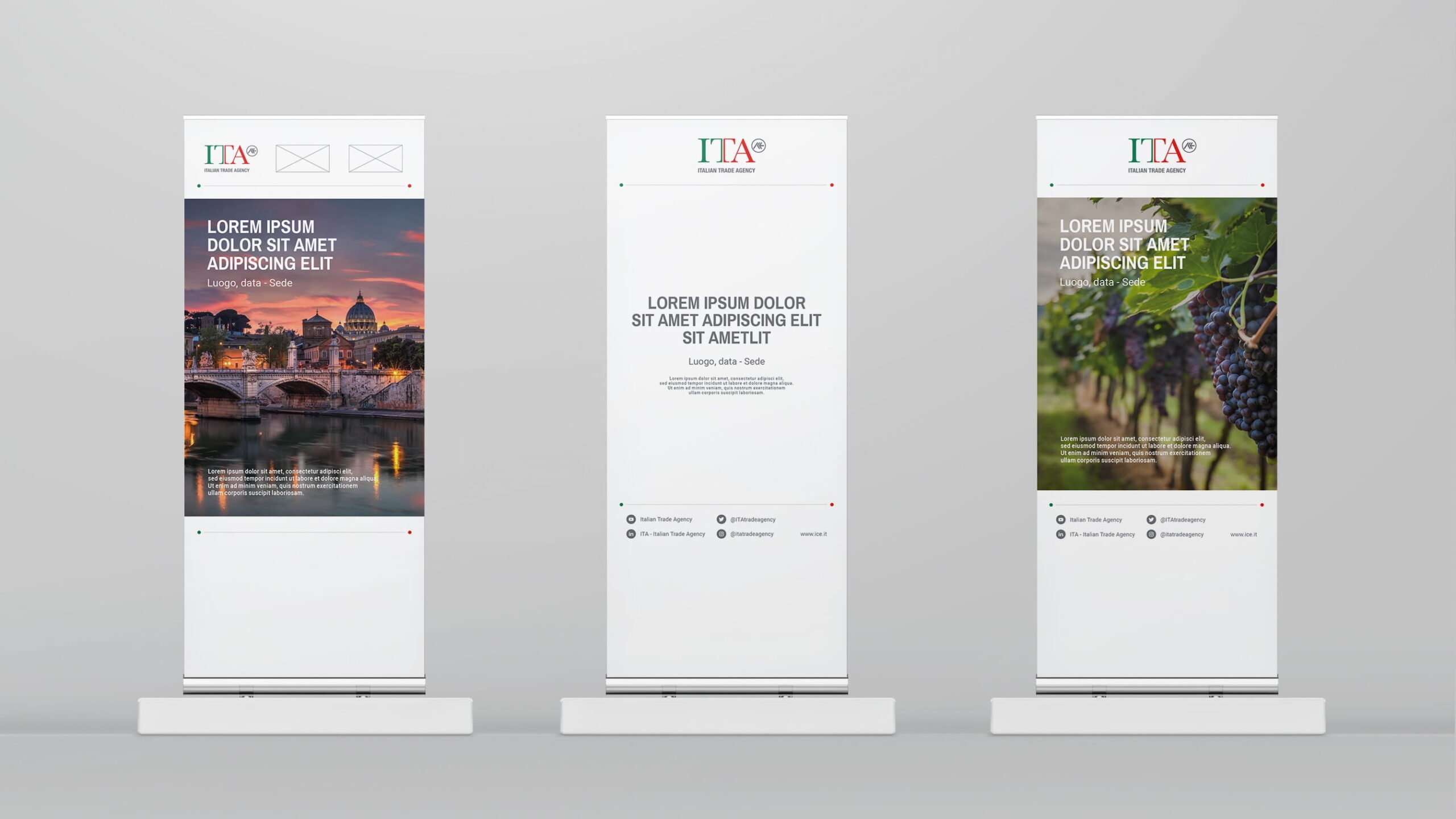
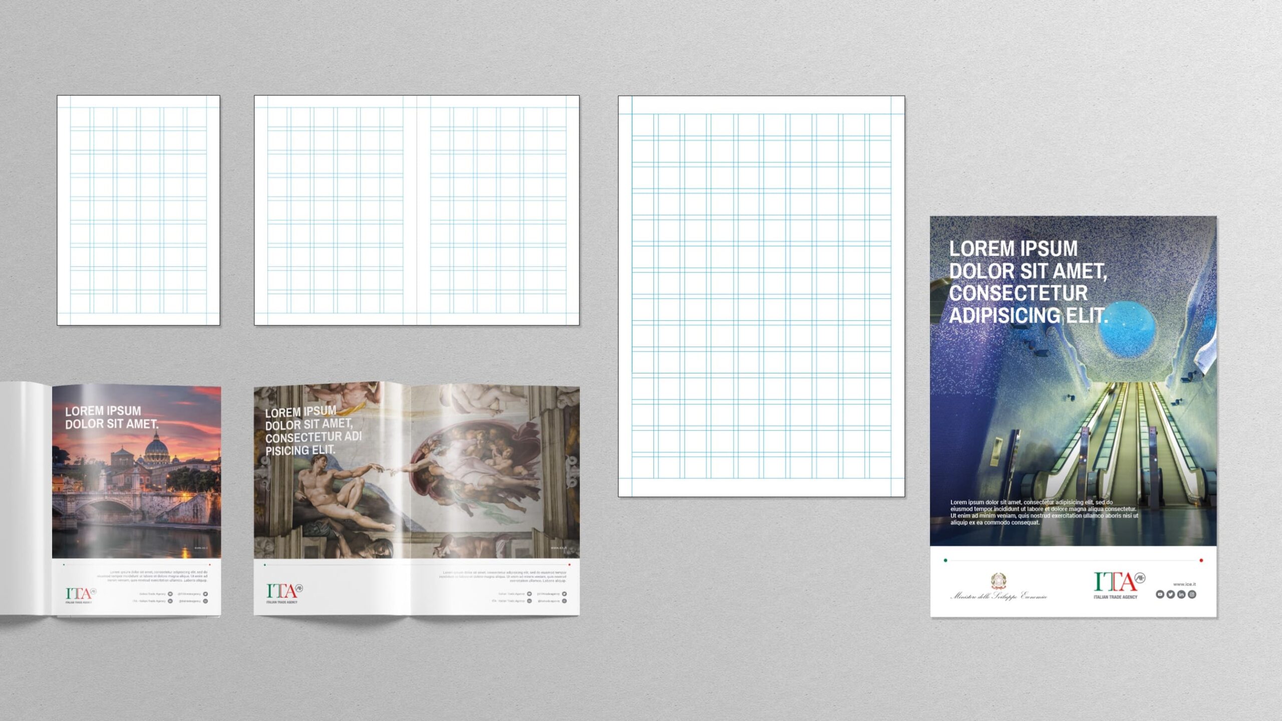
ADVERTISING
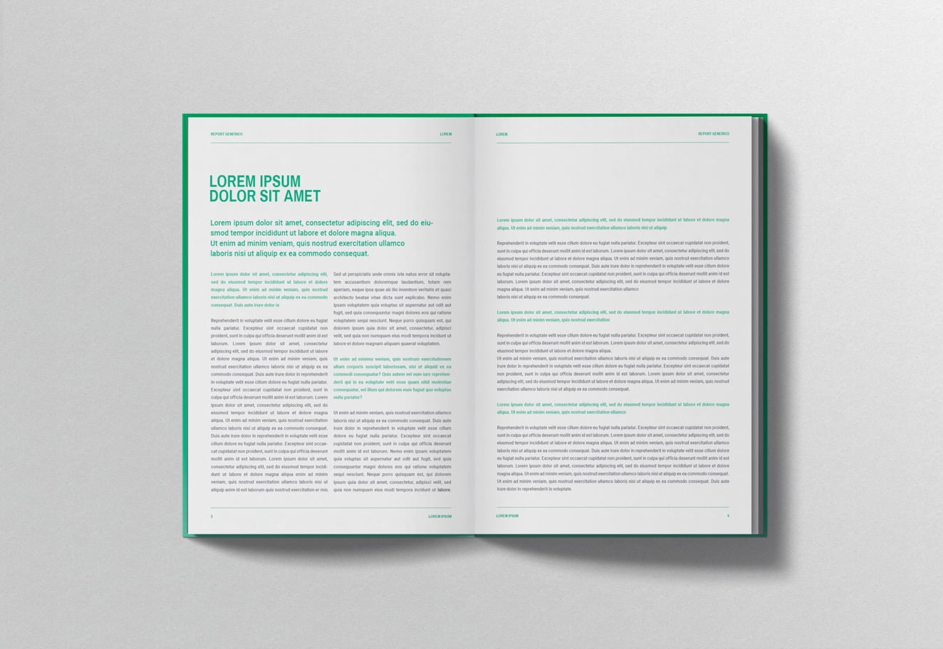
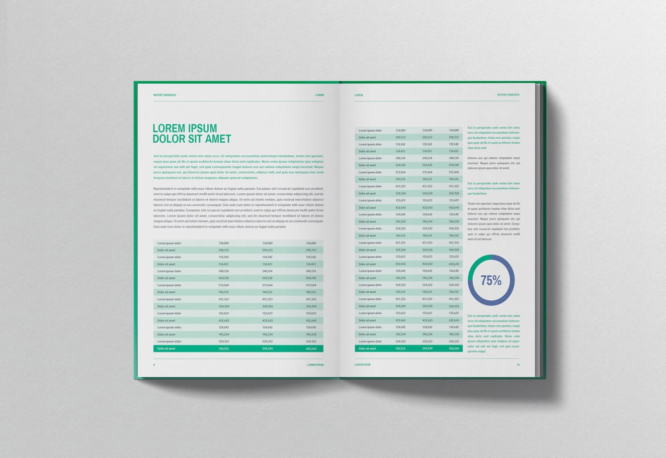
ANNUAL REPORTS
TEAM
Managing Director
Marco Venuti
Account Manager
Silvia Bianchini
Creative Direction
Michele Savino, Gioia Riccioni
Art Direction
Flavio Milazzo
WHAT WE DID
Brand Identity
Packaging & Product Design
RELATED PROJECTS →