Maximizing the performance
of a logo design.

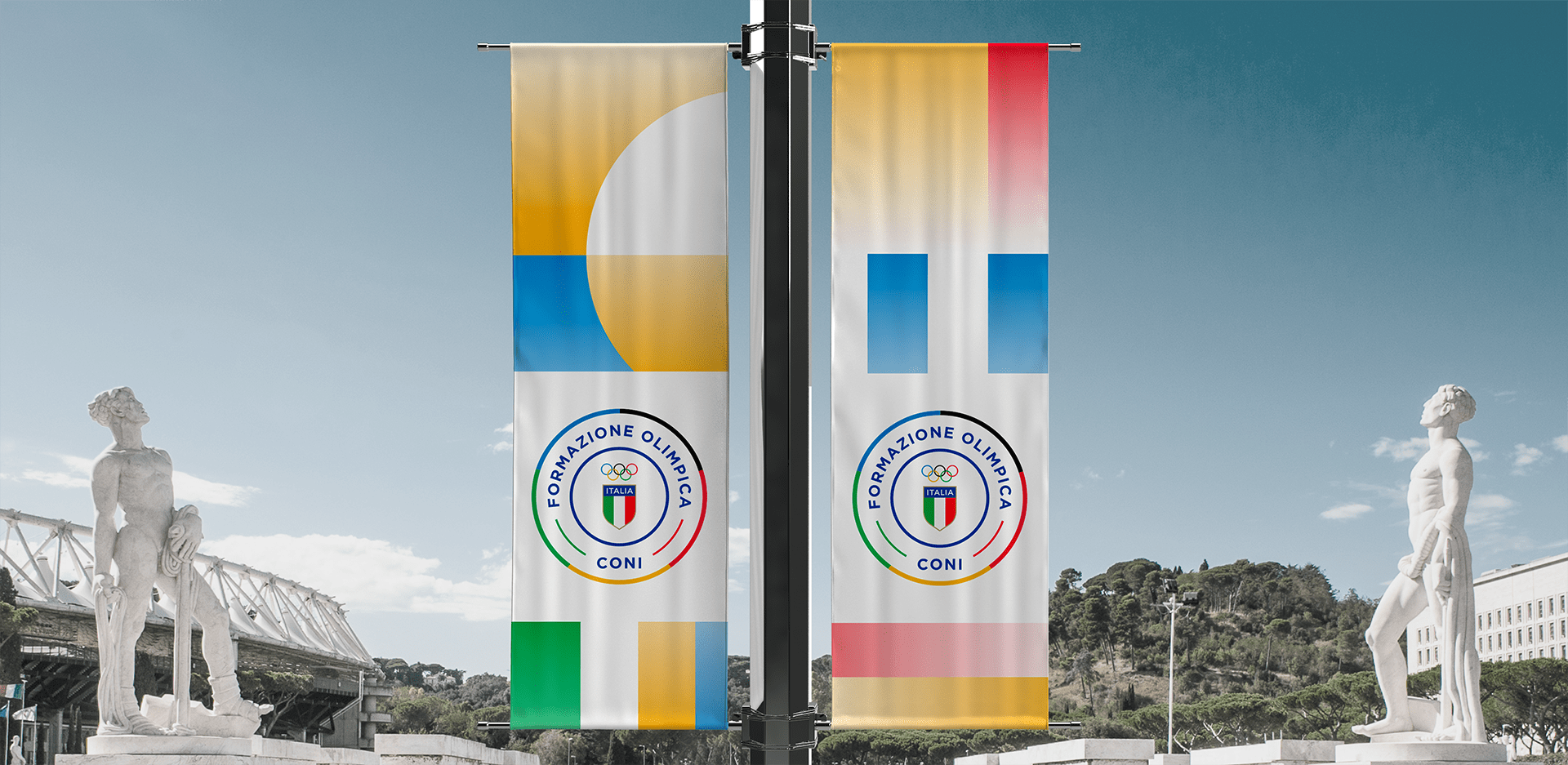
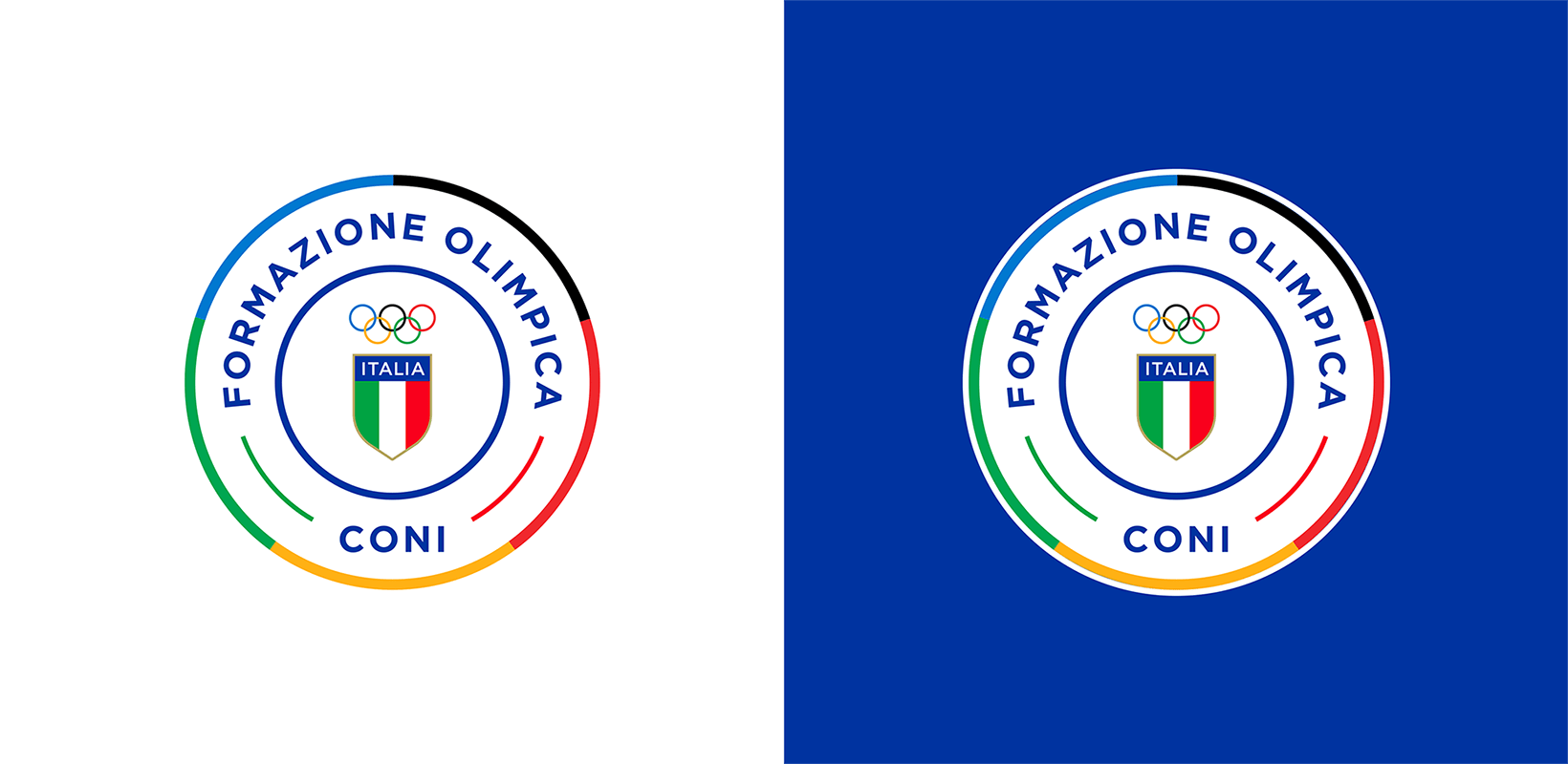
CONI OLYMPIC TRAINING
A Brand Identity for the new home of CONI’s Sports Sciences.
BRIEF
CONI launches a new project with an eye to the future: from the need to keep the skills of all roles, technical and managerial, operating in the national sports sector up to date, the Olympic Training, the home of Sports Sciences, was born. For the purposes of the project, it was therefore necessary to develop a new brand identity, including logo design and key visuals designed to be declined on various touchpoints.
SOLUTION
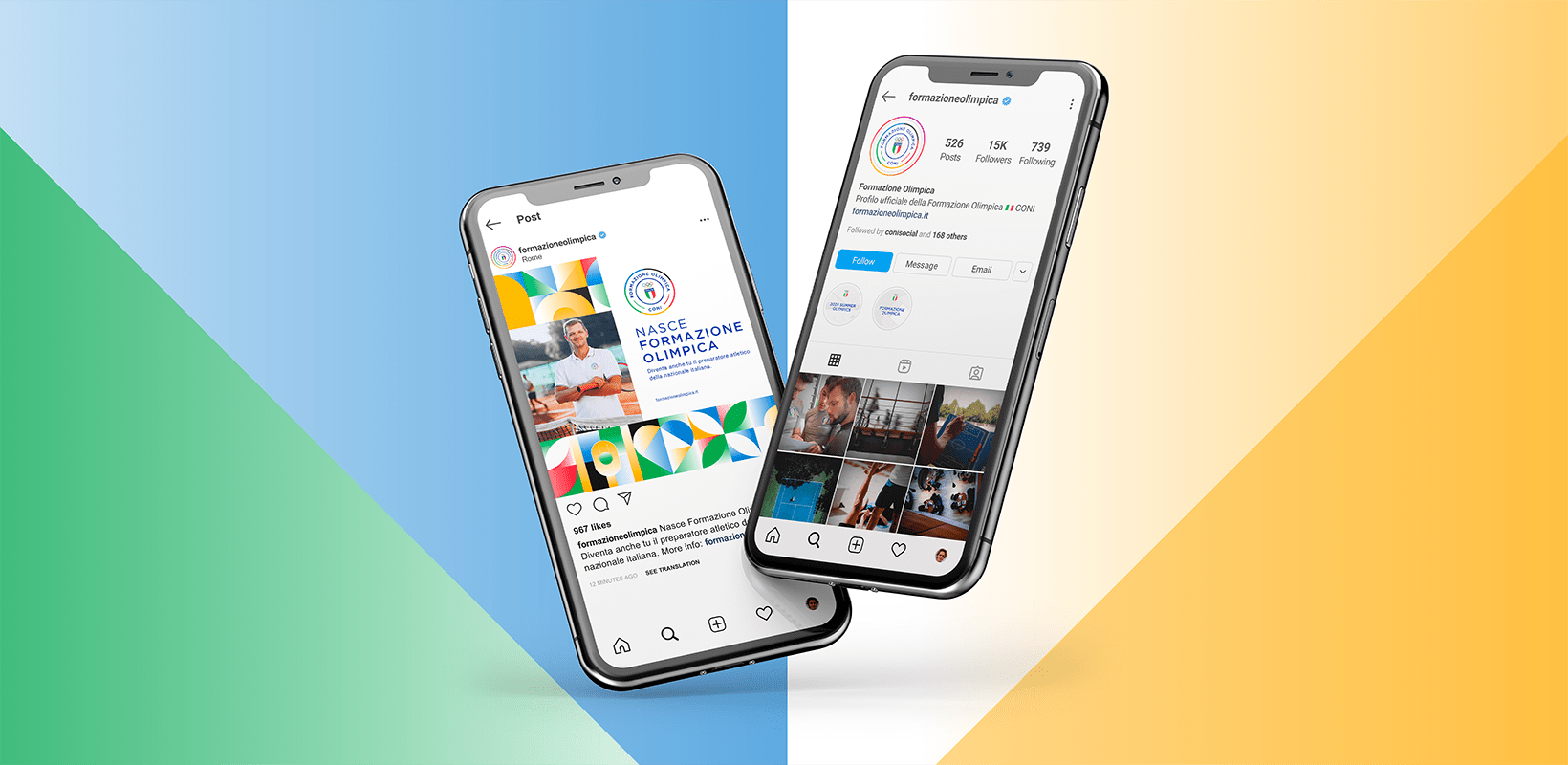
The theme of “training” is expressed in the keyvisual in a changing alphabet of lines and lives in the combination of colors and geometric shapes that convey the concepts of solidity and functionality. Both for the logo and the keyvisual, the colors used were taken from the official color palettes of the Olympics and CONI. All digital & print applications were developed from the visual.
A VISUAL RICH IN MEANING TO COMMUNICATE THE ESSENCE OF THE BRAND.
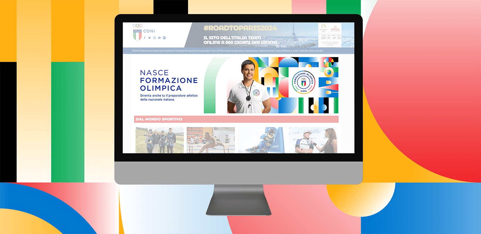
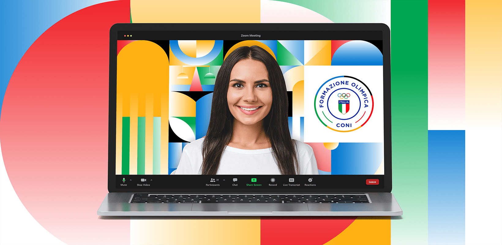
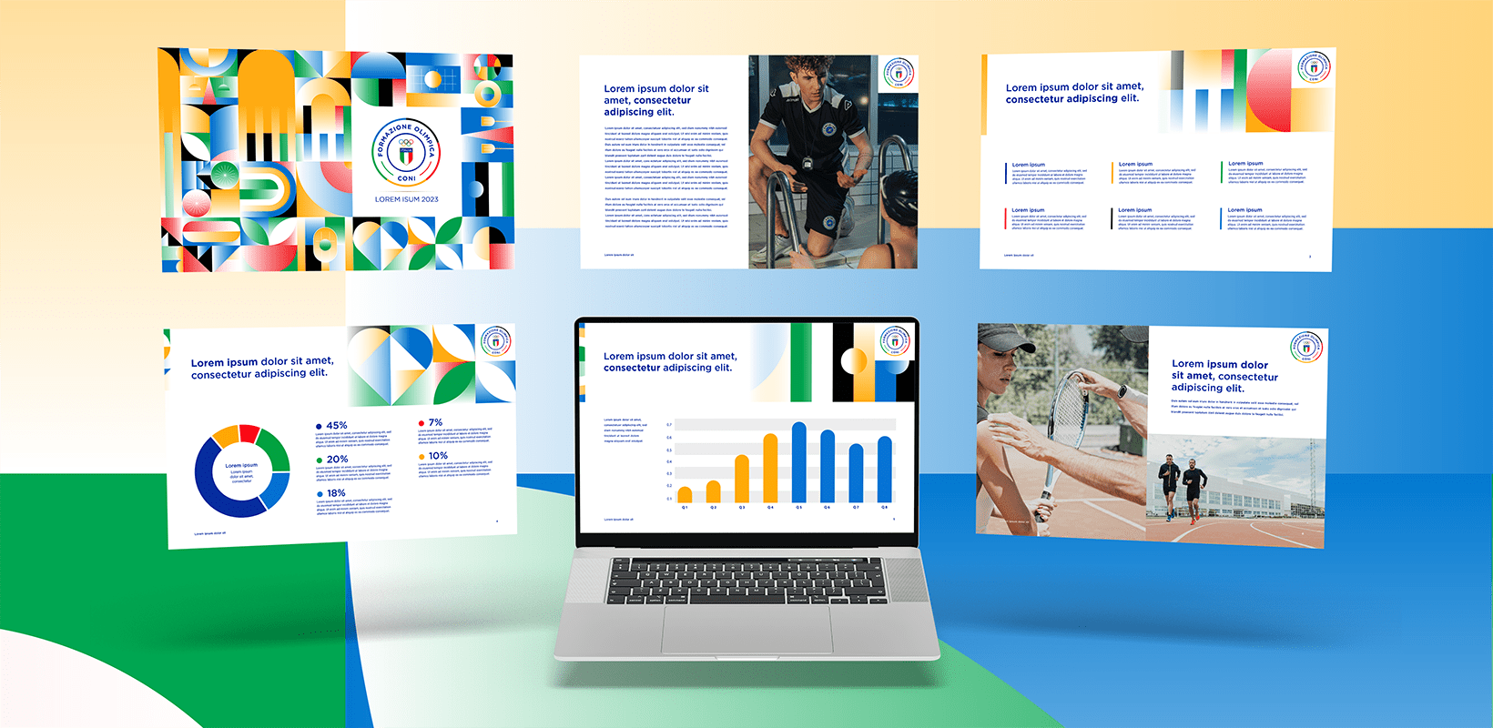
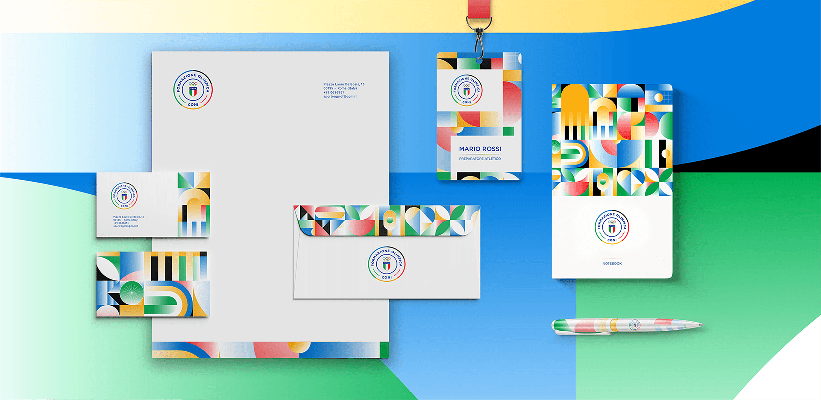
The creativity for the Olympic Training is full of meanings. In fact, a careful study was made of the main sports facilities, such as the CONI headquarters or the Foro Italico, of some Olympic disciplines such as basketball or cycling and finally on the values of training, discipline, health and nature. Among the online & offline applications developed: banners for the website, backgrounds for meeting calls, templates for presentations, pens, notebooks, badges, stationery, profile pictures and posts for social profiles.
TEAM
Managing Director
Marco Venuti
Creative Director
Michele Savino
Senior Art Director
Andrea Simone
WHAT WE DID
Art Direction
Project Management
Branding
Keyvisual
RELATED PROJECTS →