HIREMATIC BY JOB TO ME
HIREMATIC BY JOB TO ME
Technology has never been so simple and close to people.
BRIEF
Job To Me is a programmatic advertising platform that wants to position itself in the market as the most adaptable, simple and convenient tool for high-volume recruitment of qualified candidates. Objective: to differentiate the brand from a wide audience of competitors and ensure that being ‘technology pioneers’ also means, and above all, leaders in product communication.
SOLUTION
We brought a B2B brand to speak a more B2C language: dynamic, fresh and engaging. We started with people before data. A survey with an online questionnaire and one-to-one interviews allowed us to know the brand through the voice of its employees, founders and stakeholders. Then, a solid branding strategy and an explosive visual identity proved what this super smart software is capable of.
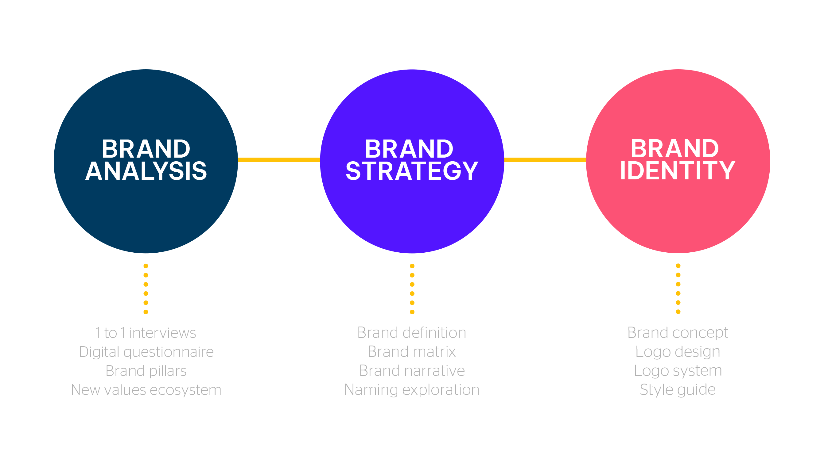
HOW TO WIN THE CHALLENGE OF A COMPETITIVE MARKET
To differentiate a company in a competitive market, it is important that the technology concept is matched with simplicity, efficiency and customization. One of our strategic goals was to reduce complexity by making the product understandable and accessible to users. For this reason, the approached a narrative that focused on persuasive language, tangible benefits and opportunities for growth.
AN INTUITIVE NAMING THAT TARGETS THE CORE BUSINESS
We focused on a naming that effectively communicates the function of the product. In fact, in the name Hirematic, three characteristics that enhance its competitiveness coexist: meaning, consistency and memorability. In addition to the dynamic and slender phonetics, the inclusion of the word “hire” in the naming multiplies the chances of the brand climbing to the top of Google SERP.
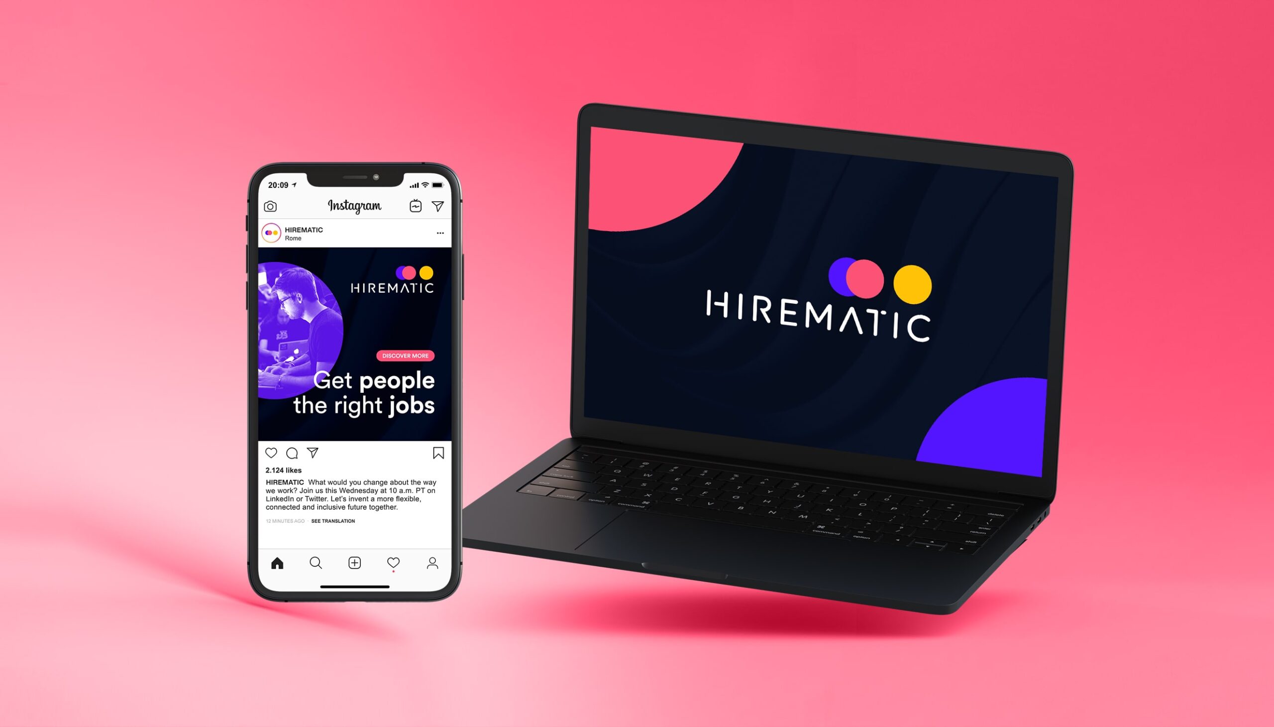
AESTHETICS MEETS PRACTICALITY
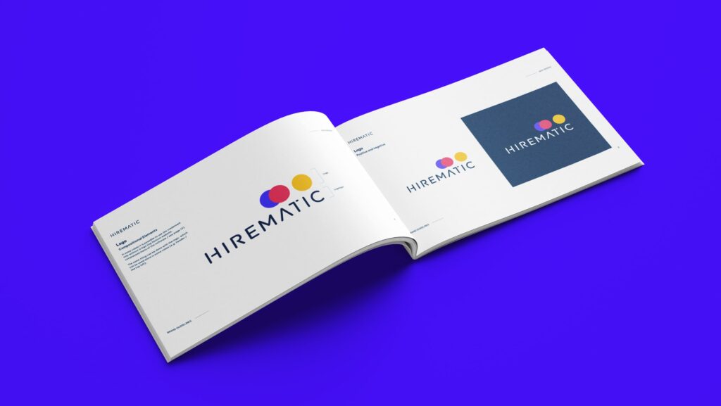
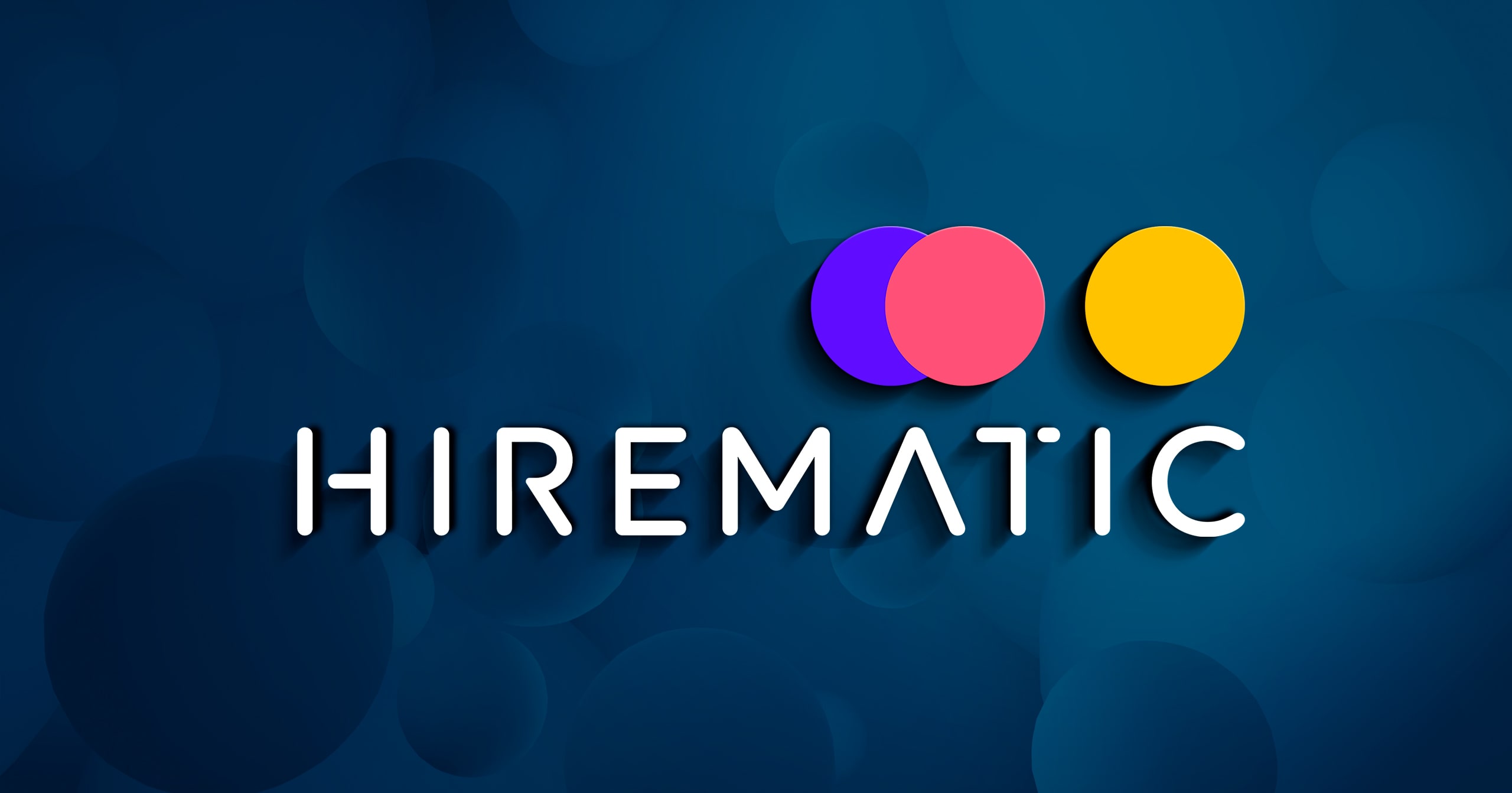
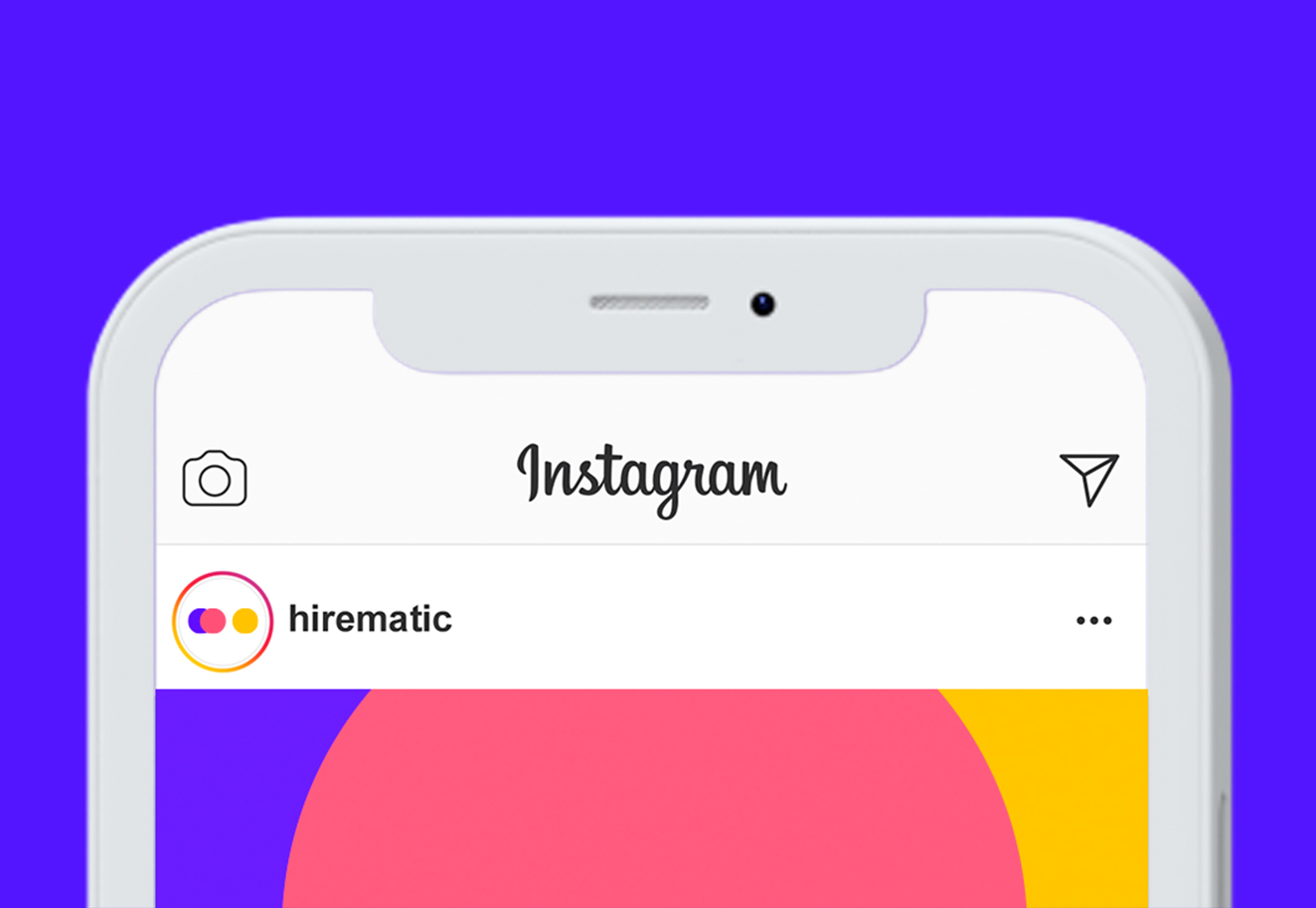
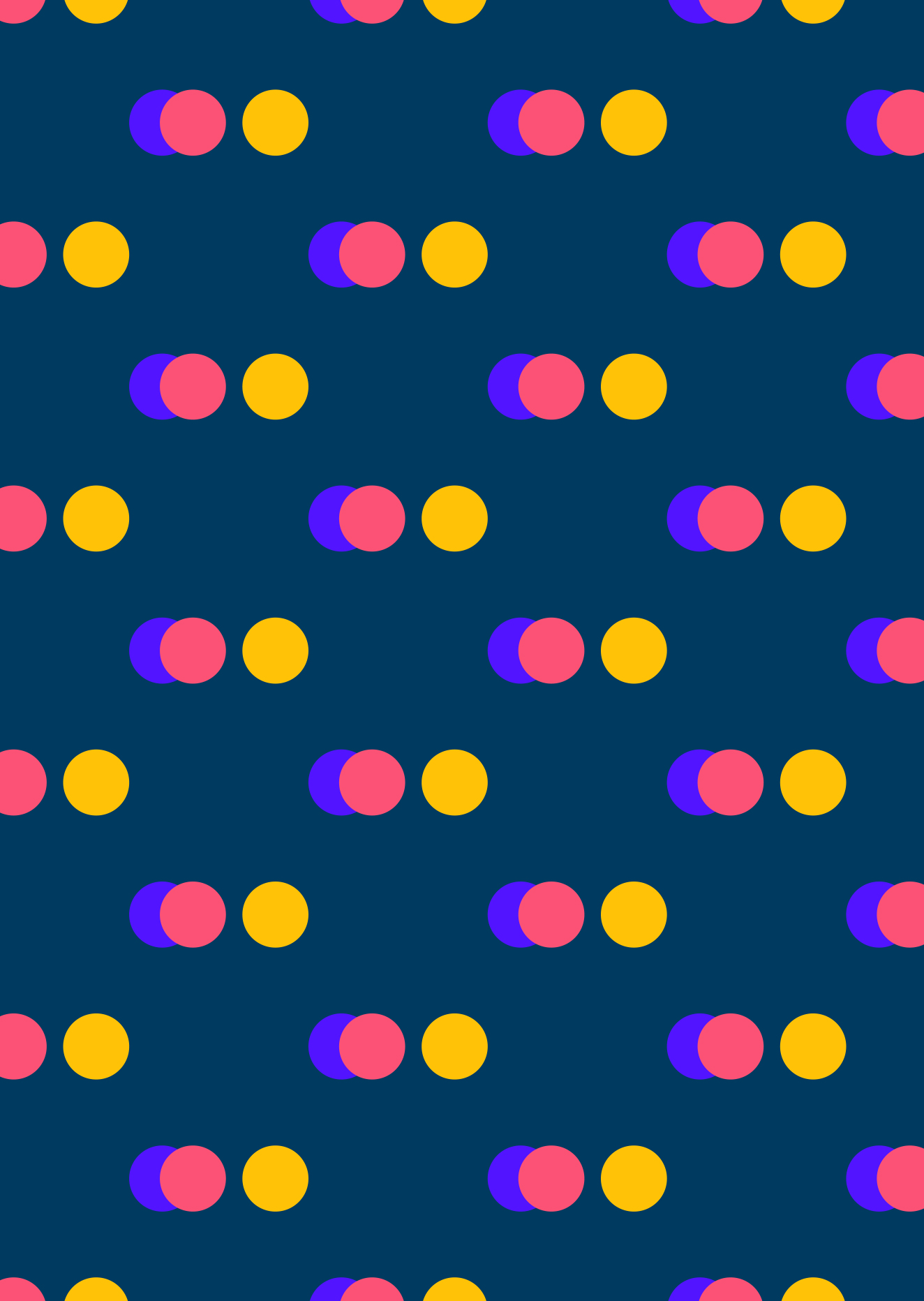
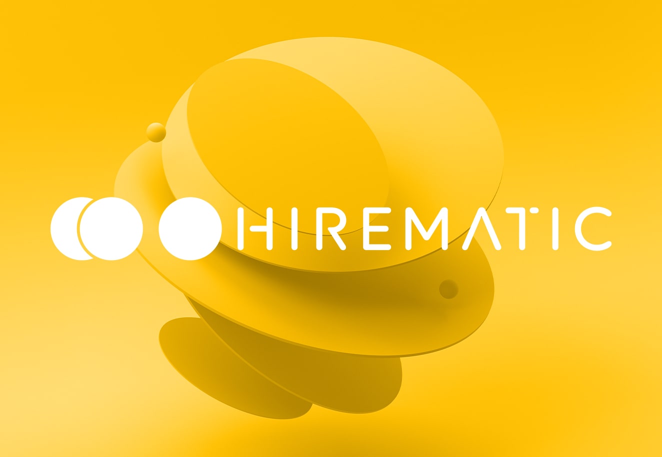
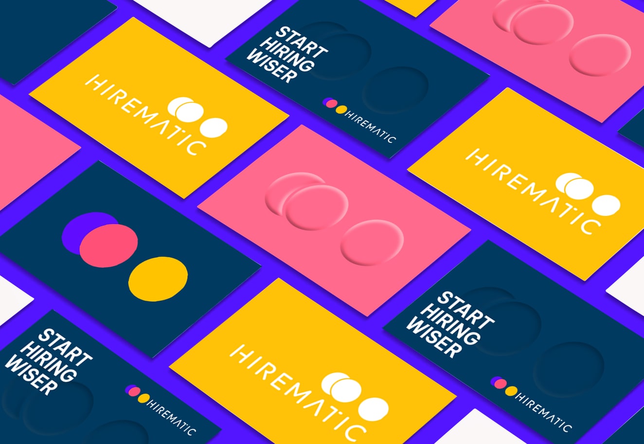
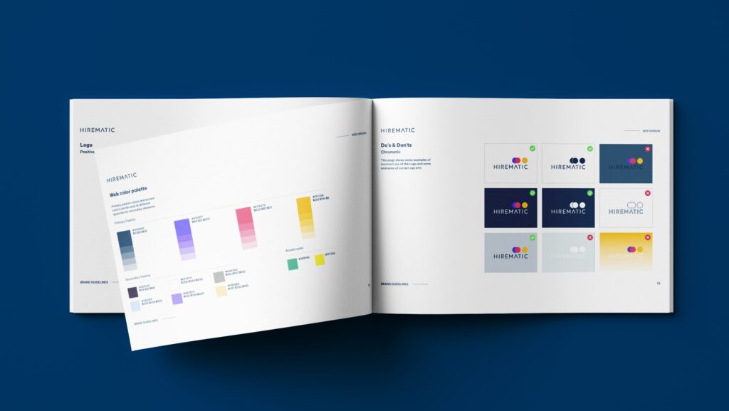
We chose to go beyond the traditional pictogram and logo structure by building a logo that is less didactic and more elegant and evocative. Two elements in the pictogram indicate the ideal protagonists of the product: man and machine, joined together, and the ‘customer’. To visually render the concept of simplicity, we used Times Rounded, a geometric Sans Serif font with rounded shapes and clear, airy letters.
TEAM
Managing Director
Marco Venuti
Account Manager
Silvia Bianchini
Creative Director
Michele Savino
Strategist & Copywriter
Andrea Poggioli
Logo design
Stanislao Migliorino
Senior Art Director
Flavio Milazzo
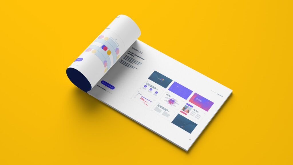
WHAT WE DID
User Research
Brand Strategy
Brand Design
Style Guide
Visual Identity
Copywriting
Art direction
RELATED PROJECTS →