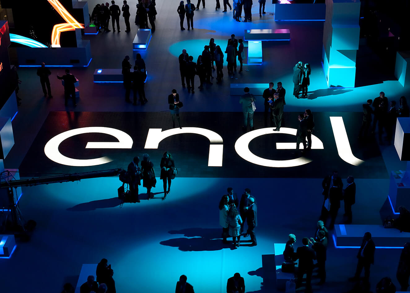
Revolutionize the world of
corporate events with a
new live digital experience.

BANCA IFIS
Redesign the strategy and visual identity of Italy’s foremost Specialty Finance Bank

BRIEF
Banca Ifis specializes in credit solutions and service for individuals and businesses. The Group which has been actively working in both the Italian and international markets for over 20 years, wants to strategically reposition itself, rationalizing and reorganizing its business units and creating a new brand system.
SOLUTION
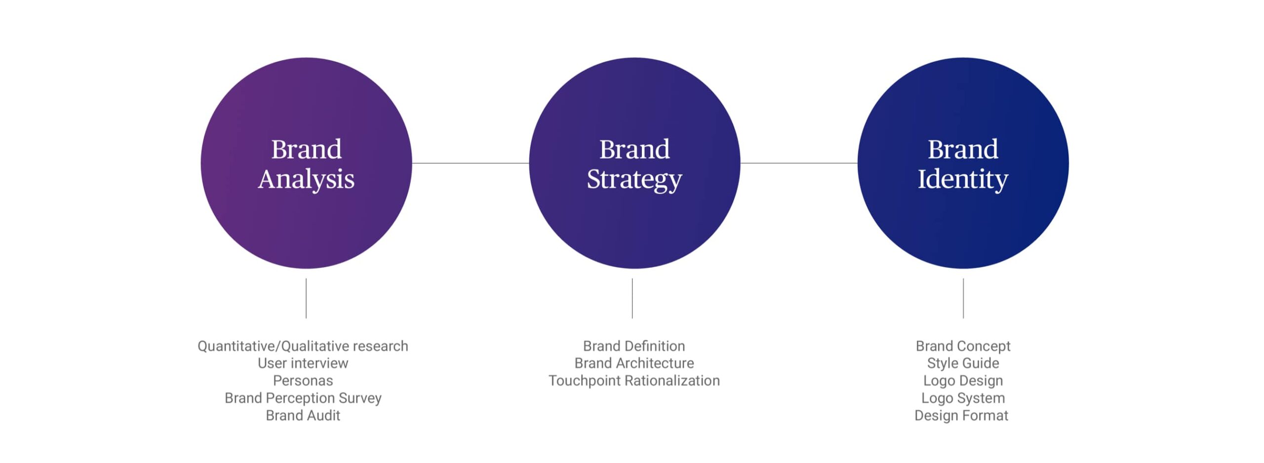
We accepted the challenge putting in place a 3-phase co-creation process between the Banca Ifis’ Management, Sales and Marketing departments, and our best strategic, managerial and creative resources. In redesigning the logo we involved all stakeholders in a synergic, open and cooperative manner.
WE LISTENED TO THE BANK SPEAKING ABOUT ITSELF
It all started with a holistic mapping of the business units within Banca Ifis, including its products, services and communication channels. In collaboration with Doxa we carried out quali-quantitative research on brand audits, user research and brand perception of brands and products involving both the Group’s employees and clients.
The results of the research allowed us to evaluate the opportunities, strategically intervening to rationalize the brands and reposition Banca Ifis.
THE NEW BANCA IFIS IS BORN FROM THE DIGITAL BLOOM
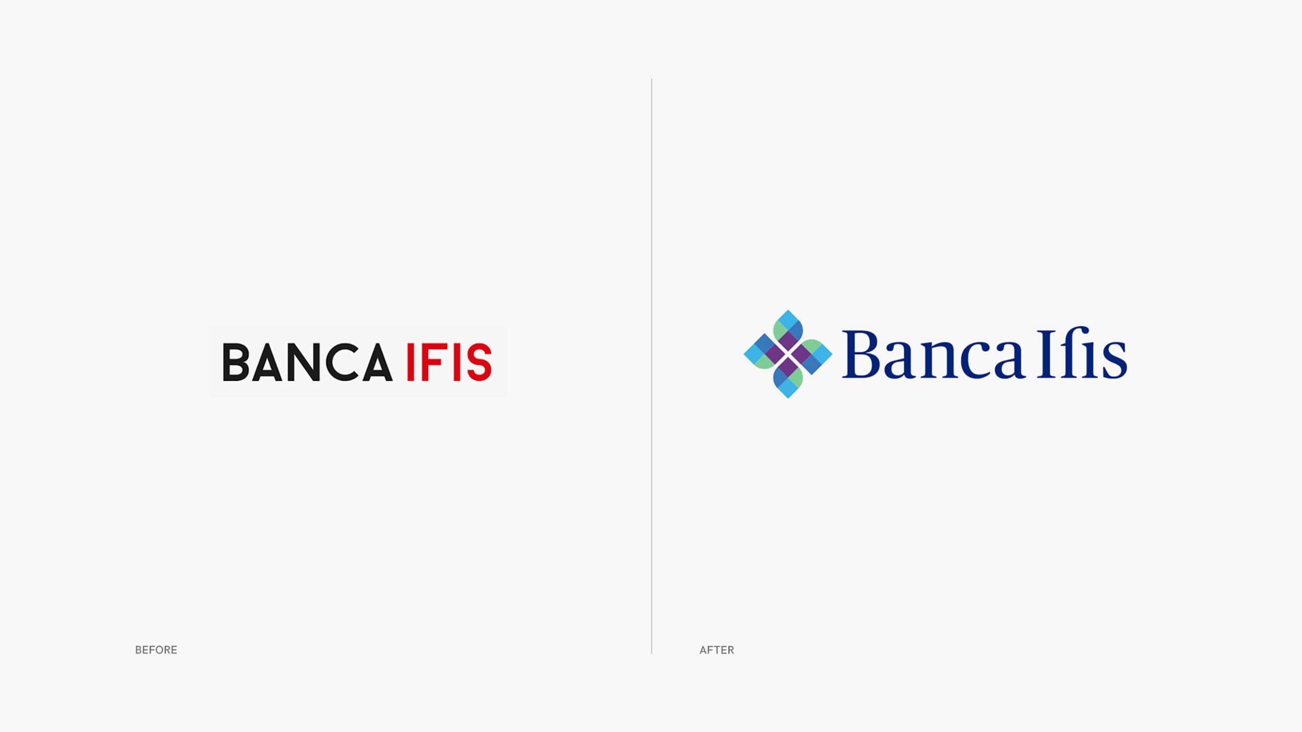
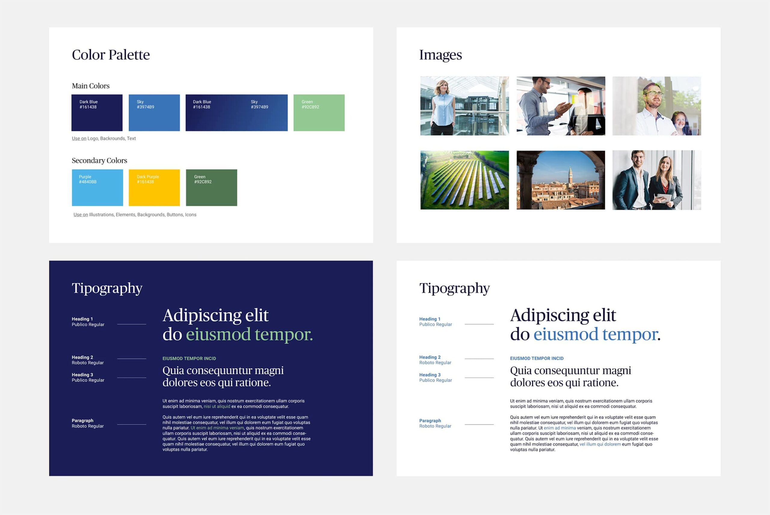
The brand identity we developed adopts the language of nature in order to communicate growth and evolution. The flower symbol that inspires the logo is formed of dynamic shapes that actively respond to changes in full respect of tradition. The centre of the flower representing the human capital fans out in a circular motion progressively activating experience, technology, cooperation and transparency.
It is the genesis of diversity that stems from the individual to then embrace the totality. The wordmark’s serif font makes the brand name more legible through the contrast between depths. The font lines evoke authoritativeness and reliability.
THE VISUAL IDENTITY GIVE SHAPE TO THE VALUES
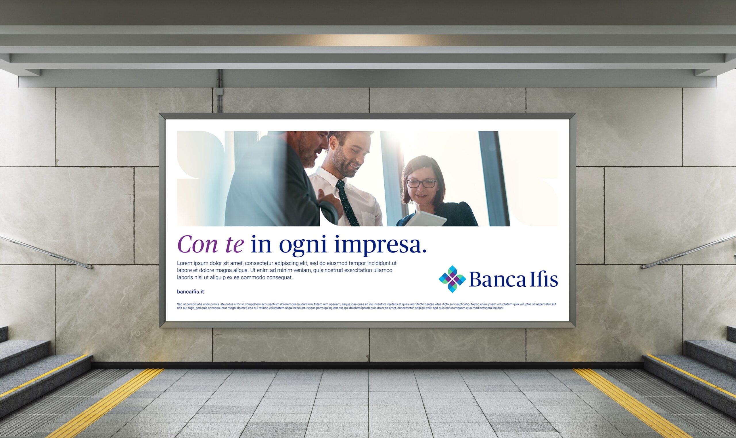
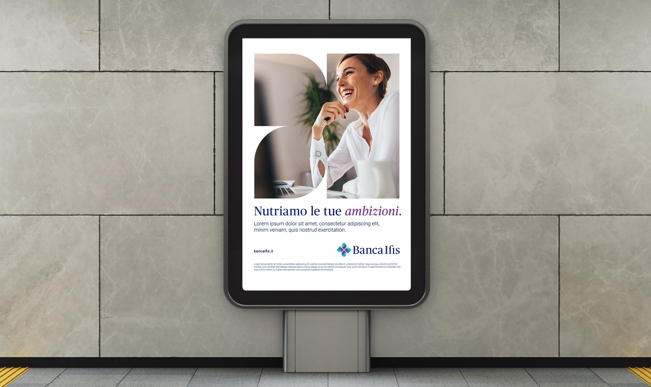
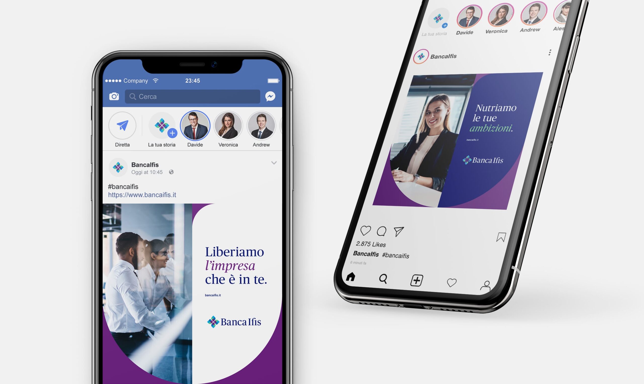
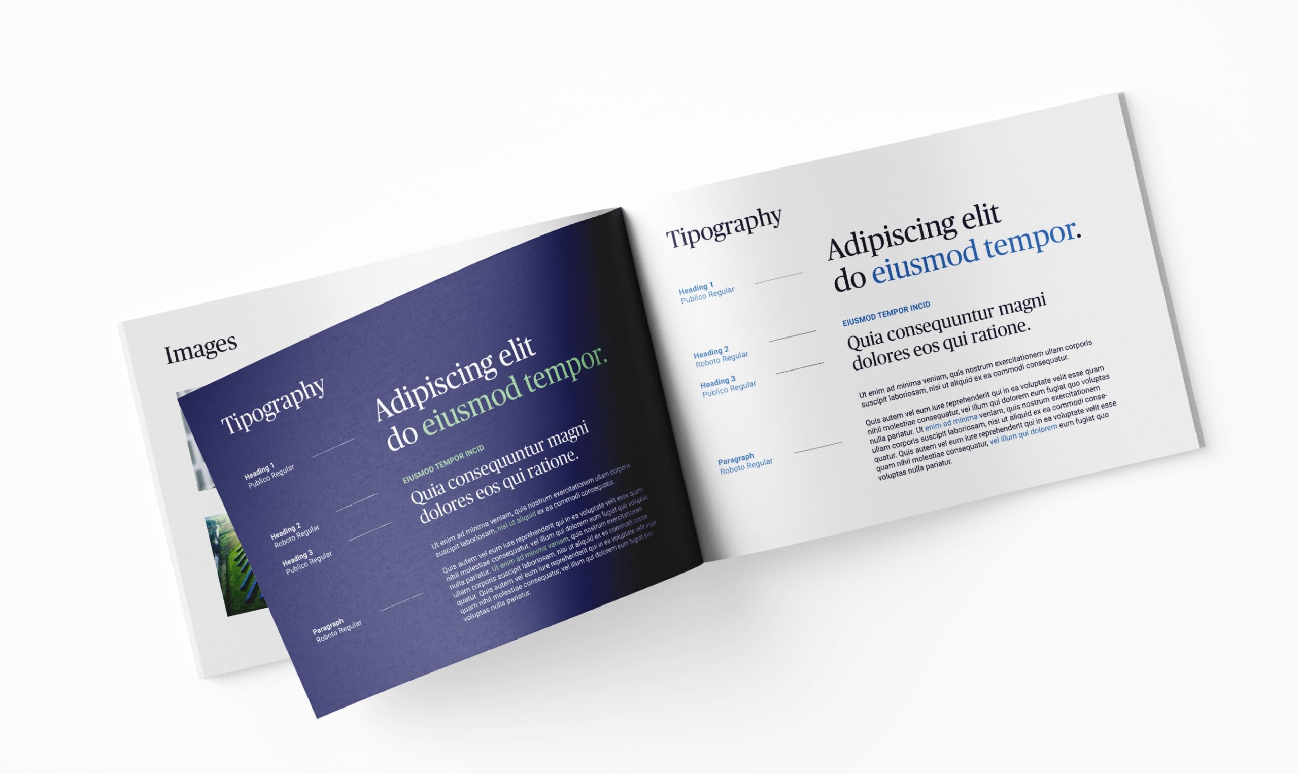
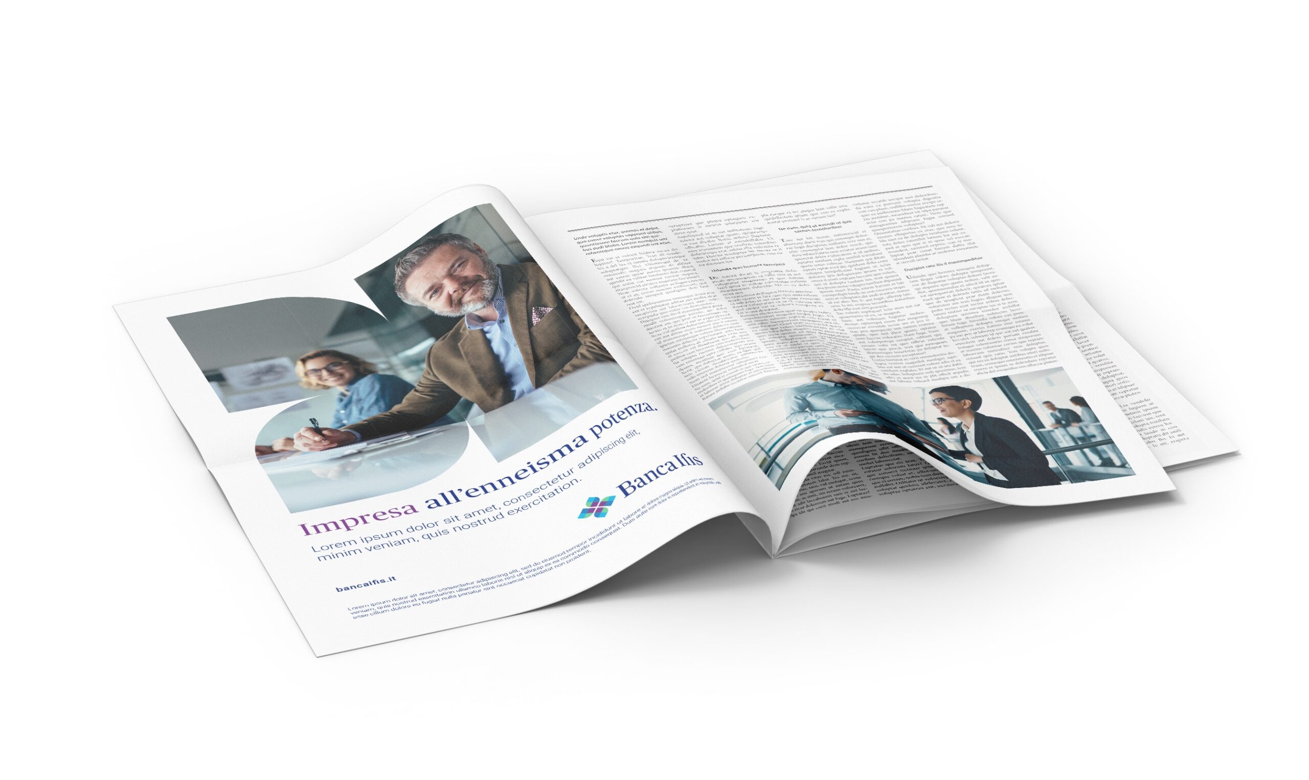
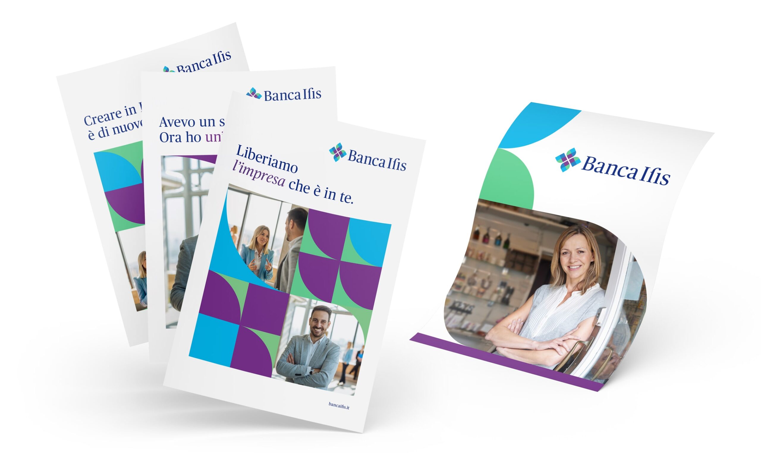
Starting from the base modules that compose the logo, we built an alphabet of values that speaks the new brand essence. The same modules of the logo define the new communication format which will then be used on all ATL, BTL and web material.
Our work then converged into the new Brand Book securing coherence of communication in all of the Group’s touchpoints. The manual has been conceived to be a visual and textual compass through which the brand can be expressed in all its strength.
POSITIONING WHICH OPENS UP NEW OPPORTUNITIES
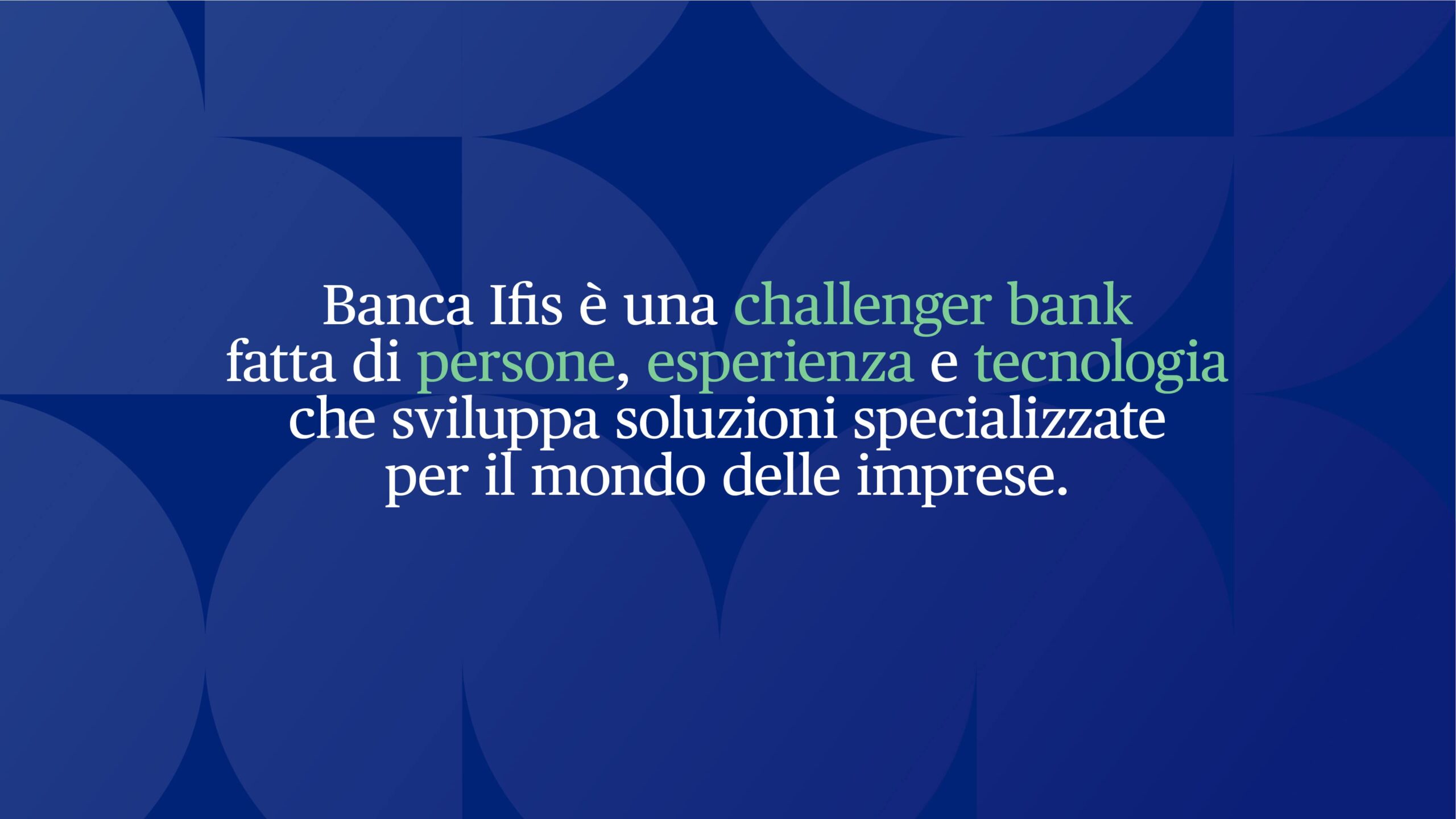
We drew inspiration from the Group’s employee and manager’s ambitions to give the brand a unique and competitive character. No longer solely a credit institution, but a challenger bank that transforms its will to create and grow as a flywheel for businesses and the territory.
TEAM
Managing Director
Marco Venuti
Creative Directors
Stanislao Migliorino & Michele Savino
Creative Directors
Emanuela Ferrandi – Senior Brand Designer
Andrea Poggioli – Copywriter
Flavio Milazzo – Brand Designer
Andrea Simone – Graphic Designer
Brand Strategist
Giulia Peresso
Account Manager
Silvia Bianchini
Motion Designer
Giorgio Tiranti
Motion Designer Junior
Giulia Alberti
WHAT WE DID
User Research
Brand Strategy
Brand Design
Style Guide
Visual Identity
Copywriting
Art Direction
RELATED PROJECTS →